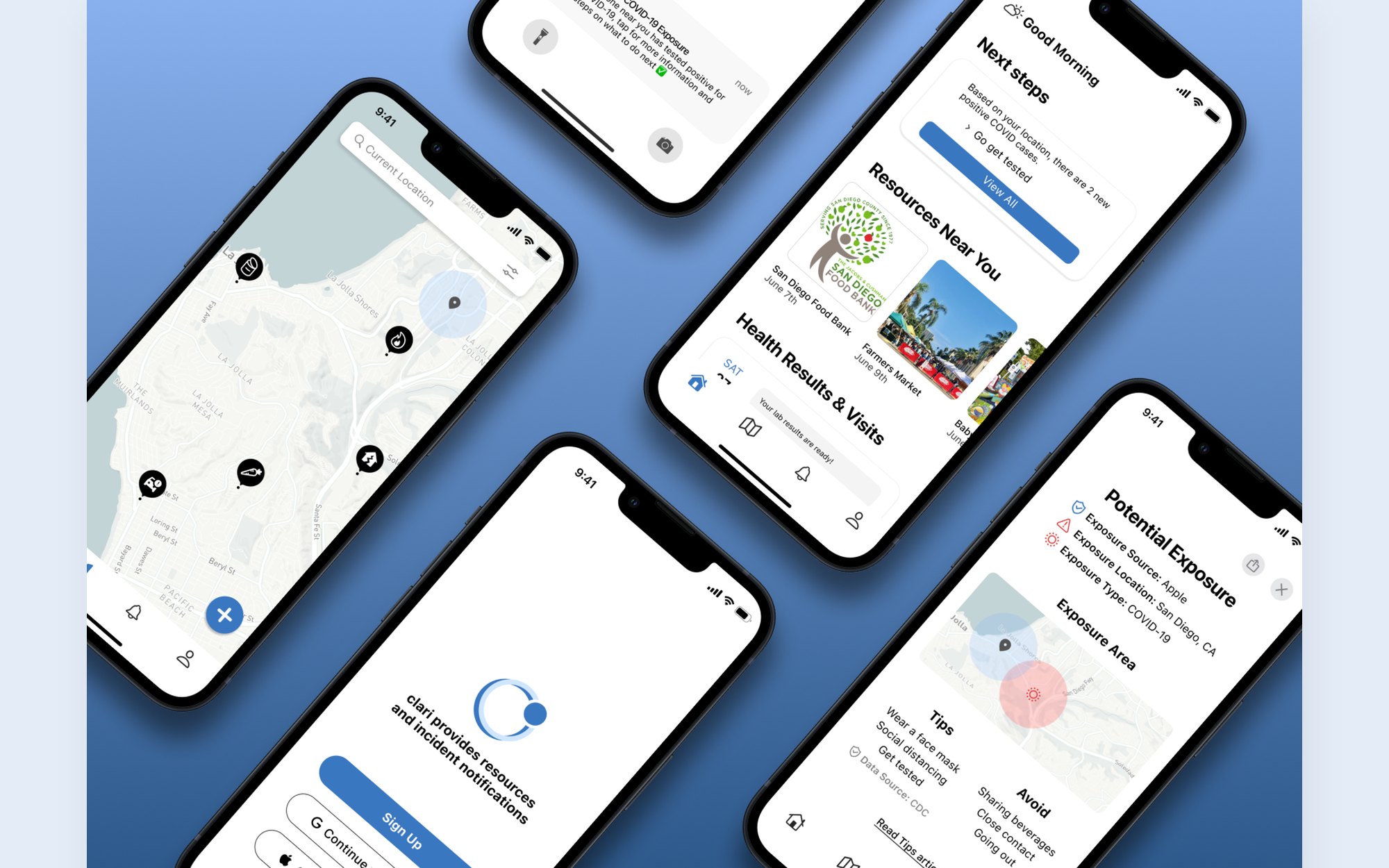
Clari sends incident alerts with clear next steps and connects people with local resources, from food banks to health appointments. As design consultants at the UCSD Design Lab's Center for Health, our team of five took it from interviews to a tested prototype in one quarter.
27
Interviews on and off campus
12
Usability testers across 2 rounds
4 of 5
Round 2 testers found Clari easy to understand
Problem
Using COVID-19 as a reference point, we found people piece together updates from social media and government sites, and struggle to reach everyday resources when things go wrong.
55%
use social media and notifications to stay up to date
85%
rely on trusted government sites for reliable news
74%
have struggled to access everyday resources like food
How might we give the public credible, timely information for both their basic and personal needs?
Research
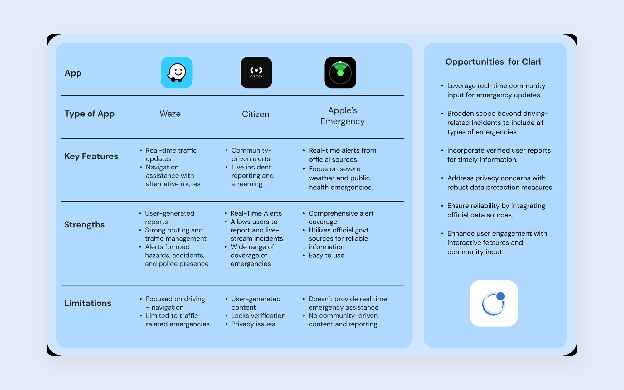
I compared Citizen, Waze, and Apple's emergency alerts. They cover incidents well, but the information is hard to digest and rarely includes next steps.
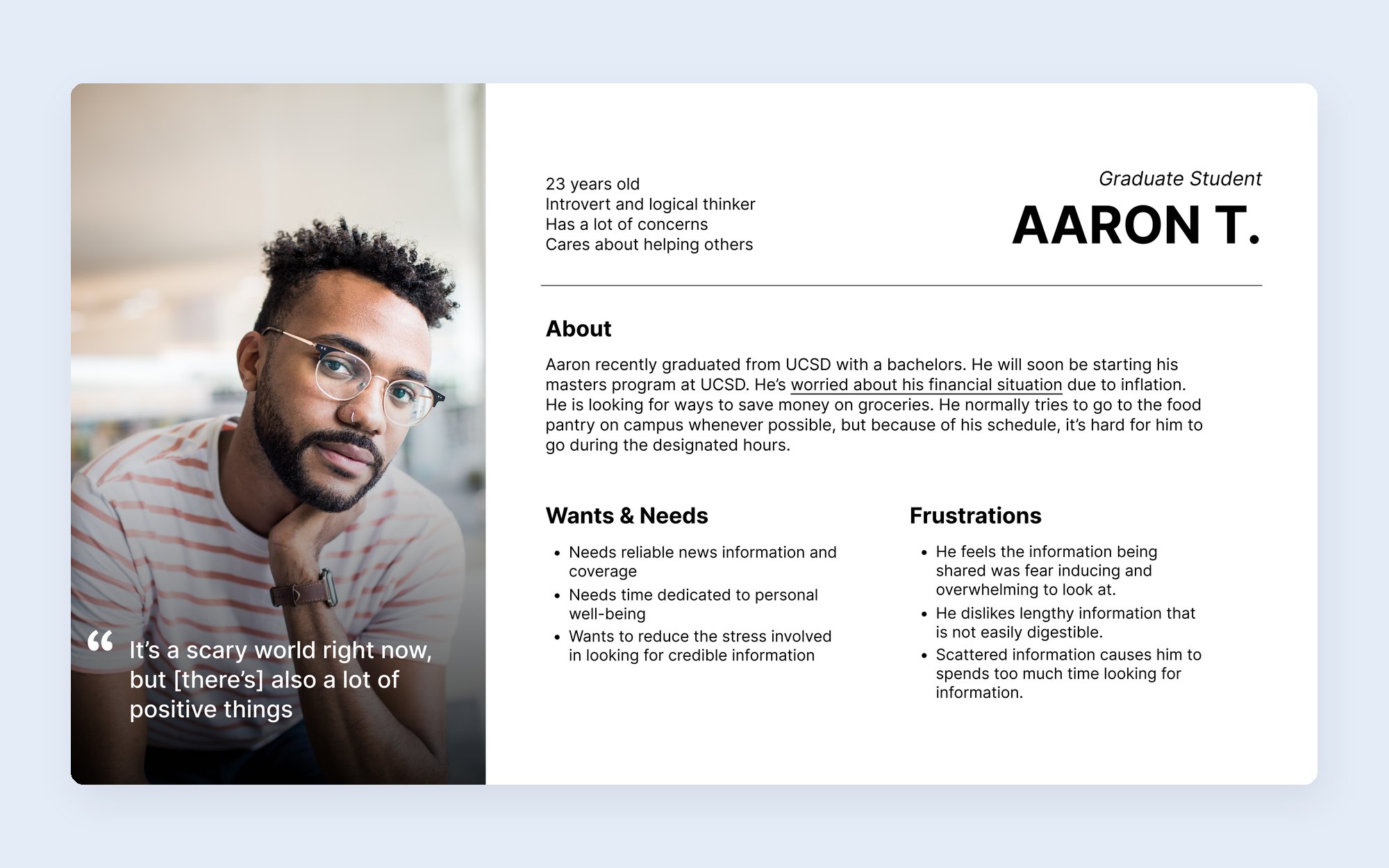
We interviewed 15 people on campus and 12 off campus, from high school students to university staff. Aaron wants reliable information without being overwhelmed by it.
Design process
We grouped features into community health, notifications, personal health, and everyday needs, with three goals: a seamless interface, no walls of text, and a community map of resources.
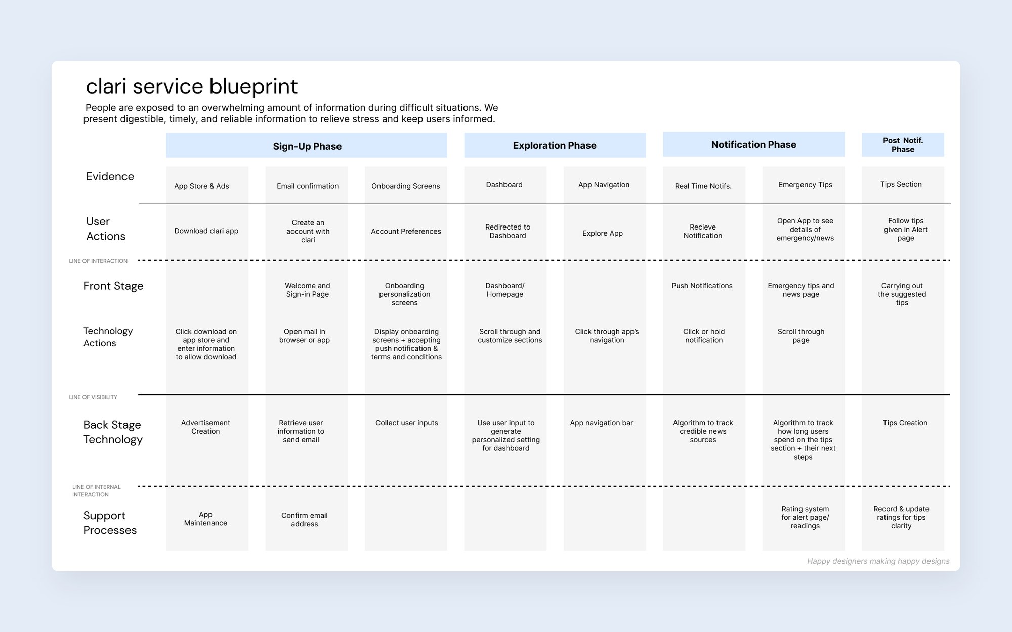
1 · Service blueprint
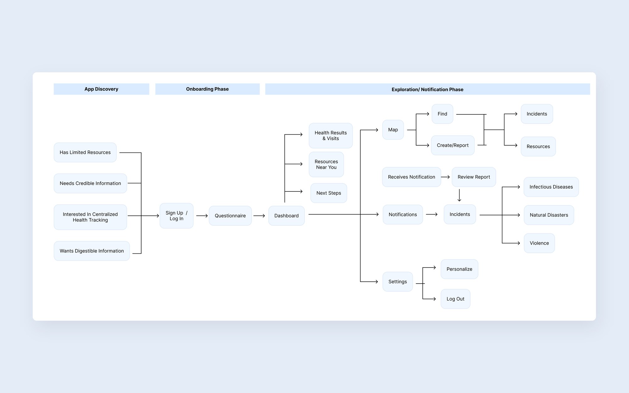
2 · Information architecture
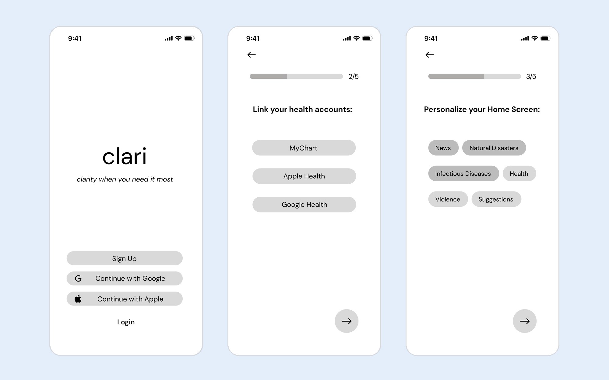
3 · Lo-fi: onboarding
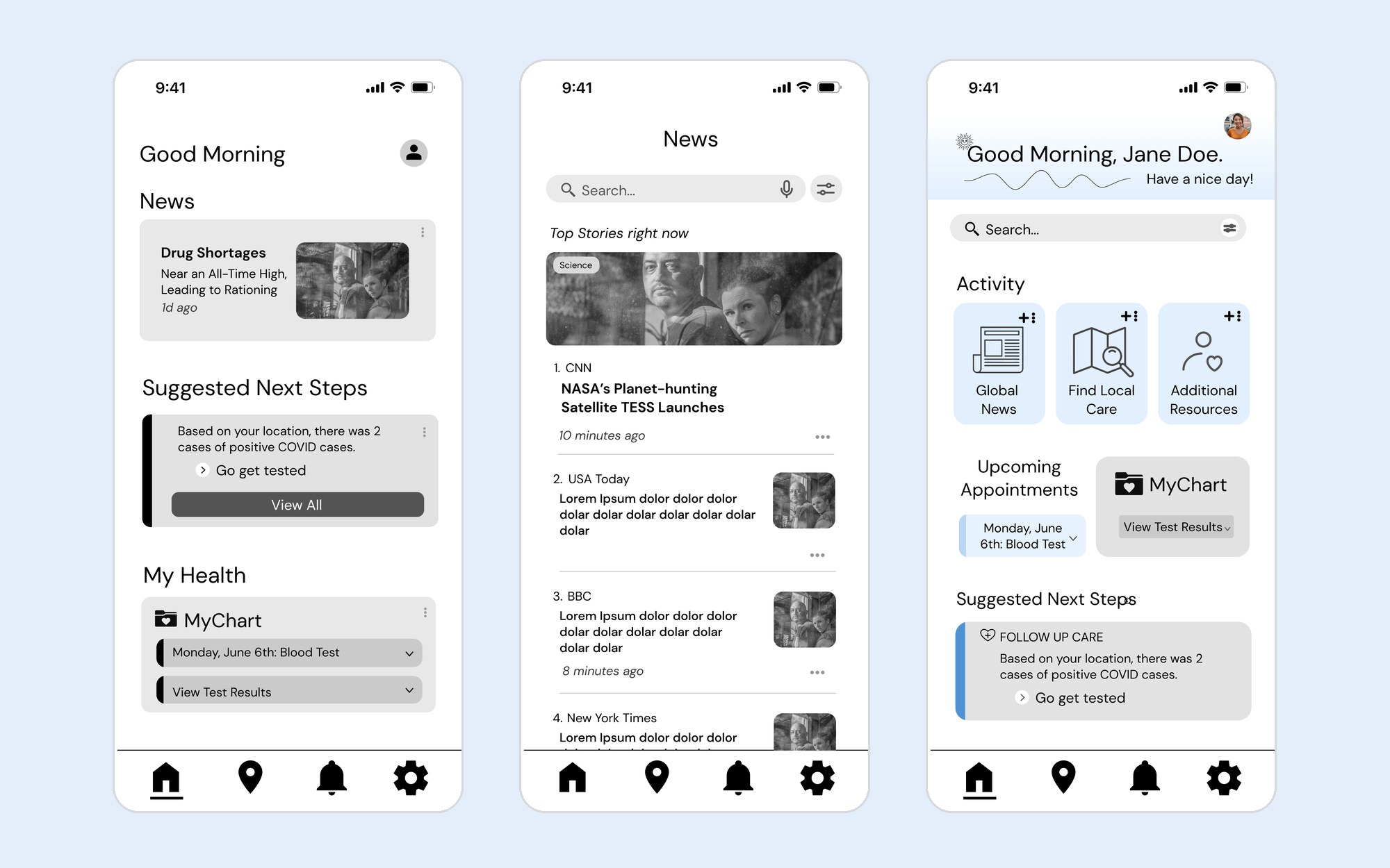
4 · Lo-fi: home
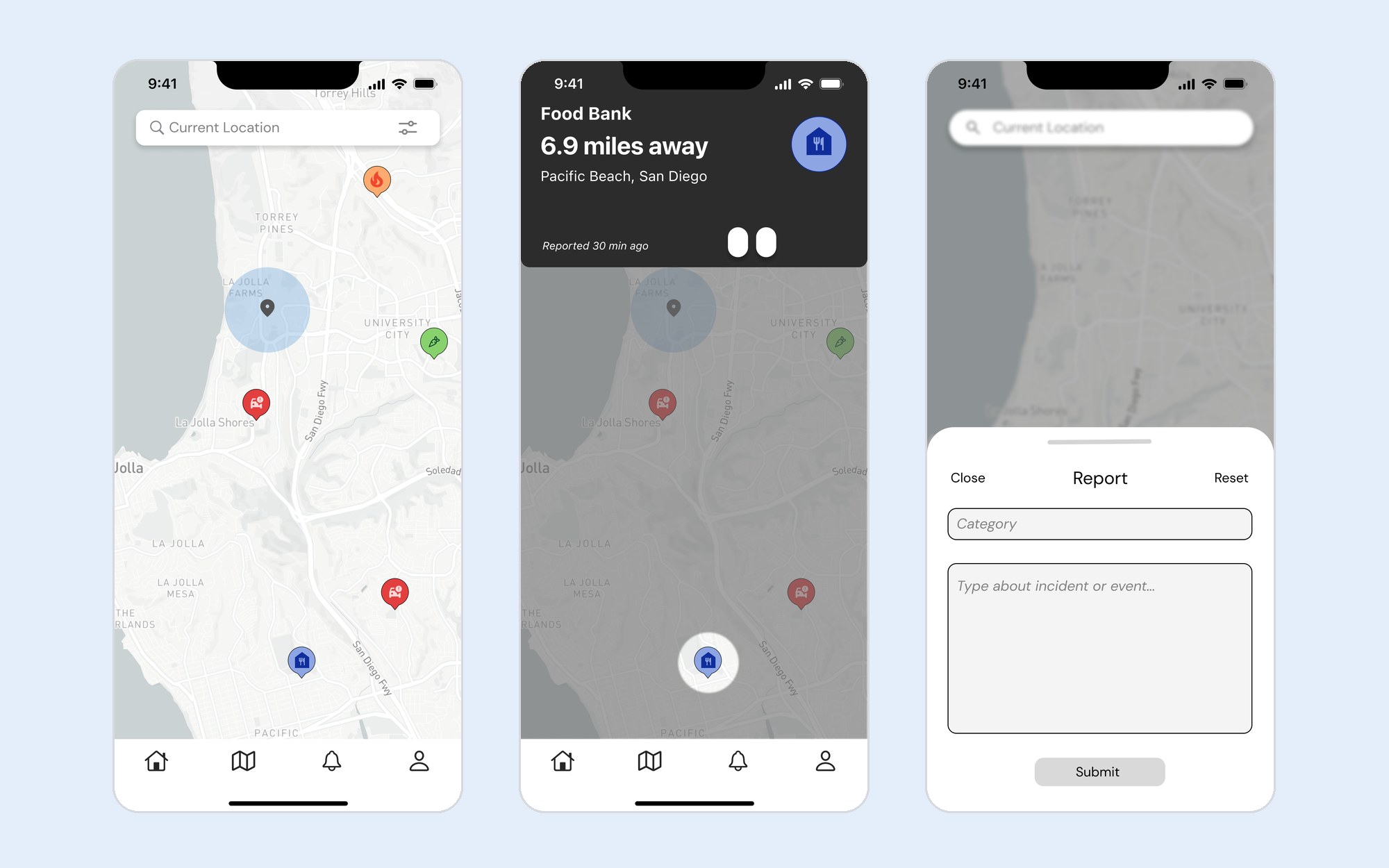
5 · Lo-fi: map
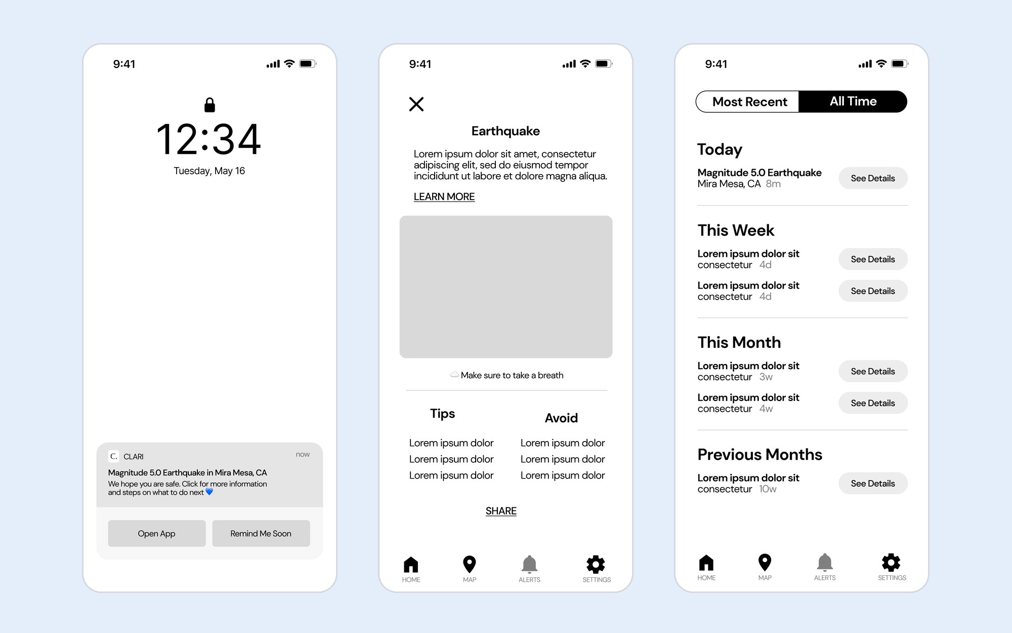
6 · Lo-fi: alerts
Usability testing
In round 1, 7 people thought aloud through 5 scenarios: onboarding, the dashboard, a notification, the map, and settings. We wanted to know if they could tell what Clari was for, read the map, and act on an alert.
“In the beginning, I thought it was an app about tracking health and weight loss goals.” — Round 1 tester
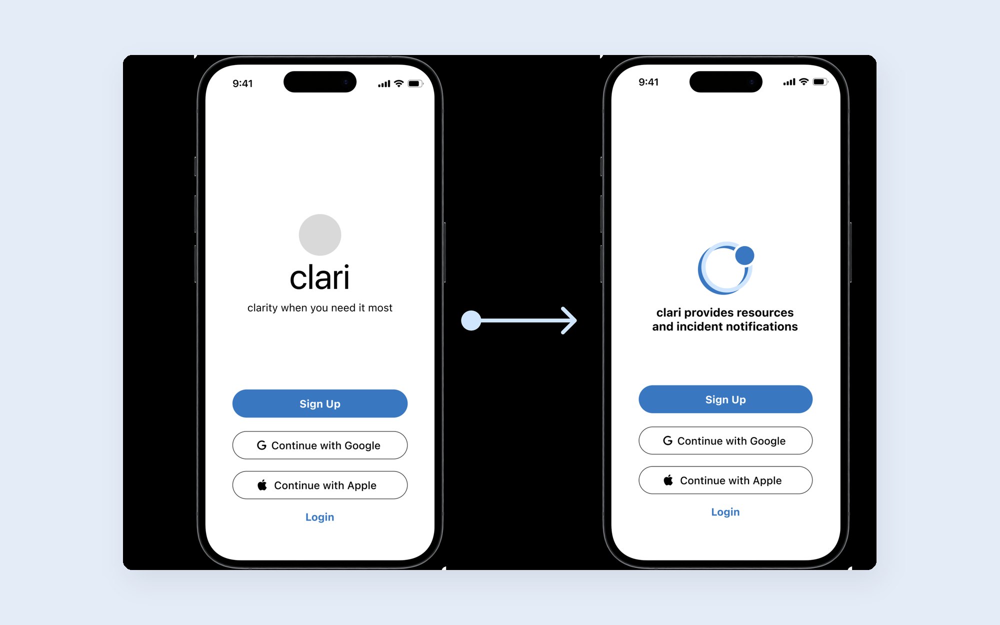
6 of 7 testers · Opening screen
"Clarity when you need it most" became "Clari provides resources and incident notifications."
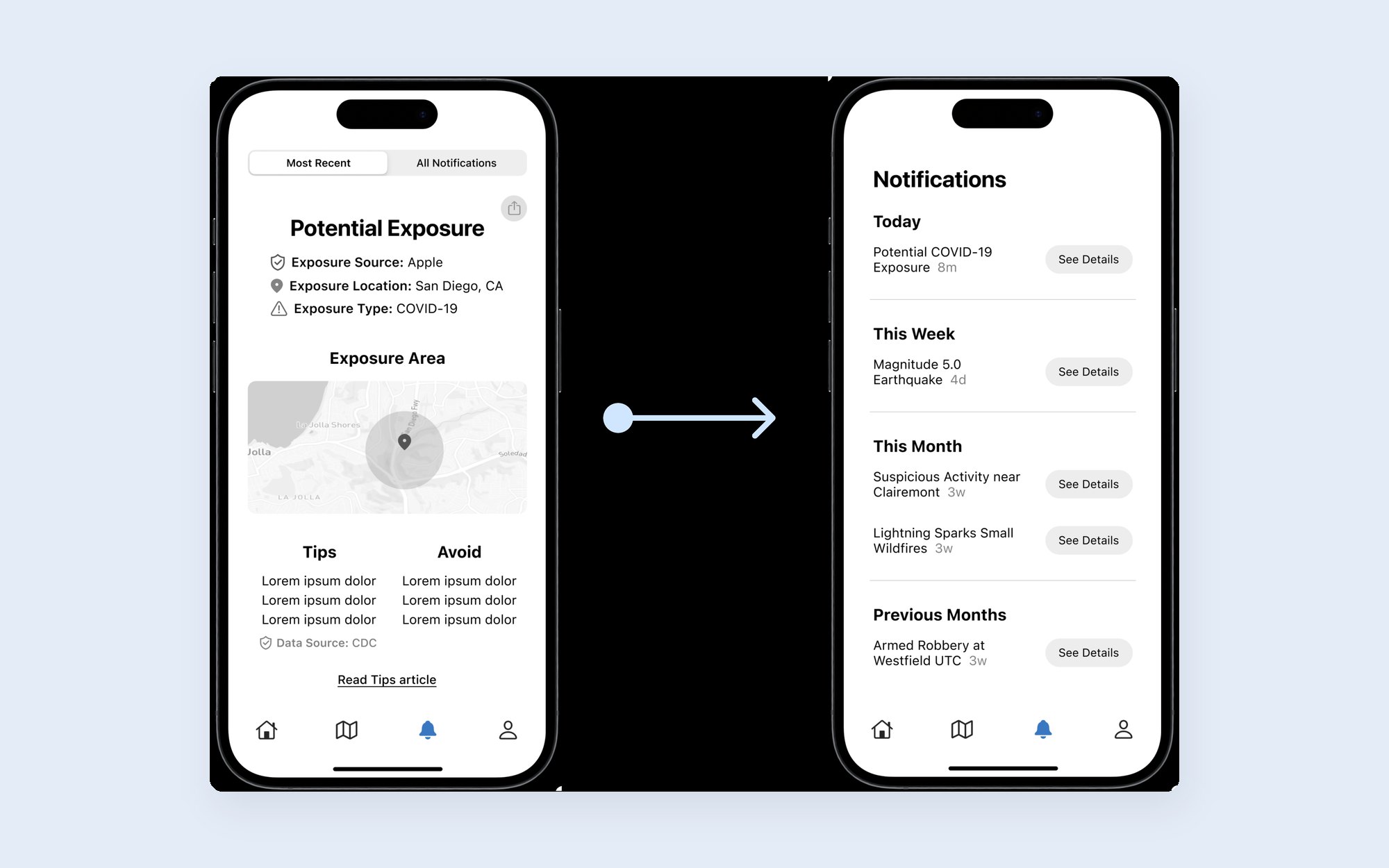
Notifications
Recent and past alerts merged into one timeline grouped by today, this week, and this month.
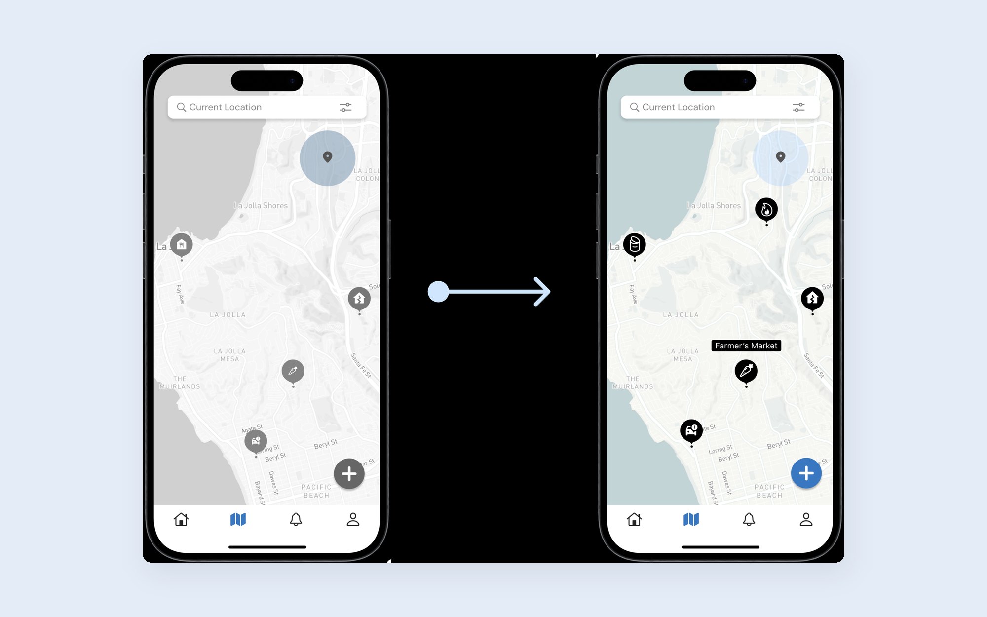
7 of 7 testers · Map
We redesigned the icons and added labels so every resource is clear at a glance.
The remaining feedback was minor, like font sizes and placement, which we fixed in the final prototype.
Final design
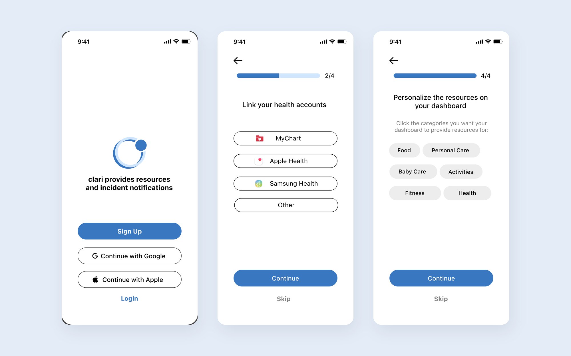
1 of 4 · Onboarding
Link health accounts like MyChart and choose which topics to see or hide.
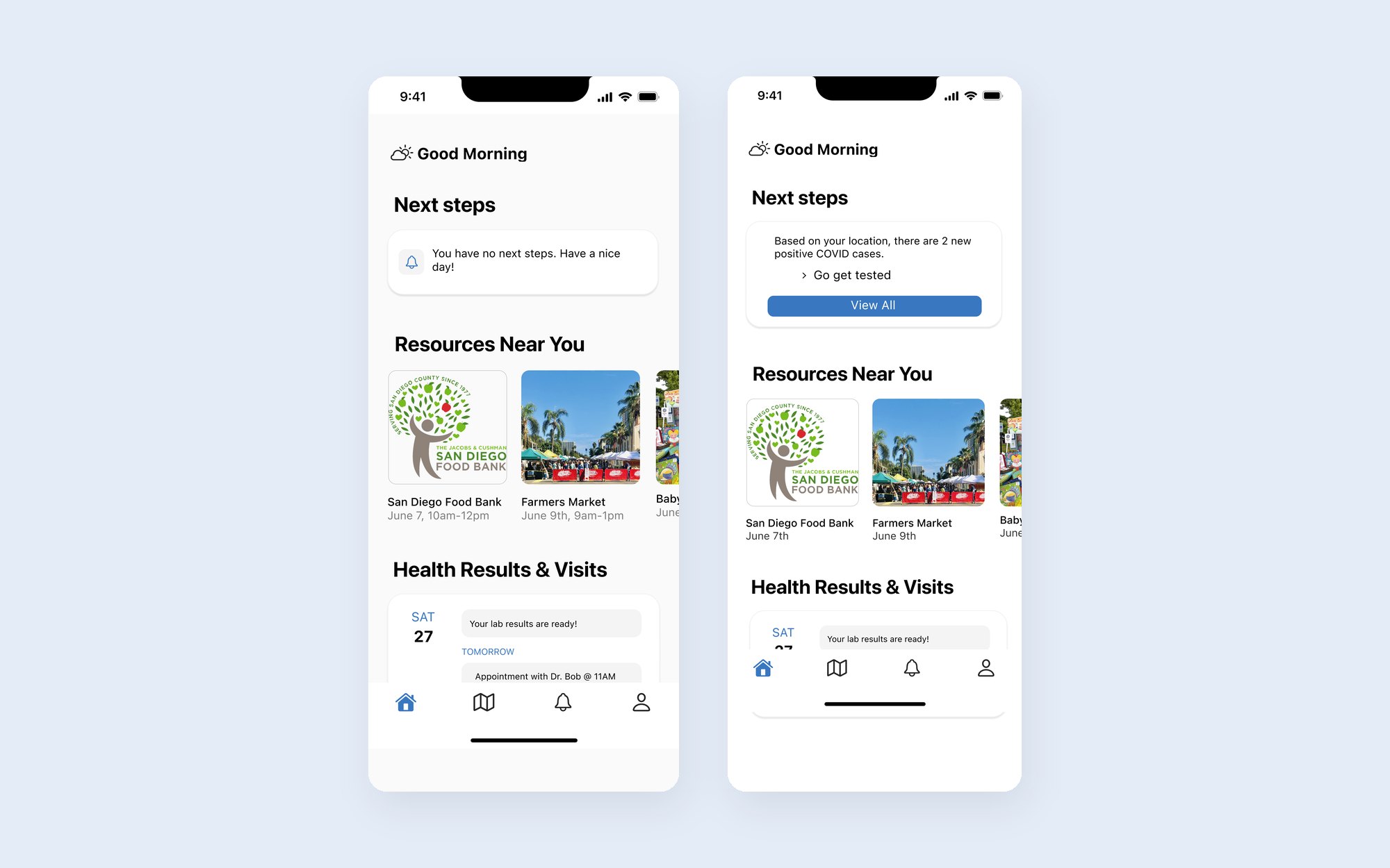
2 of 4 · Home
Next steps, resources near you, and health visits in one place.
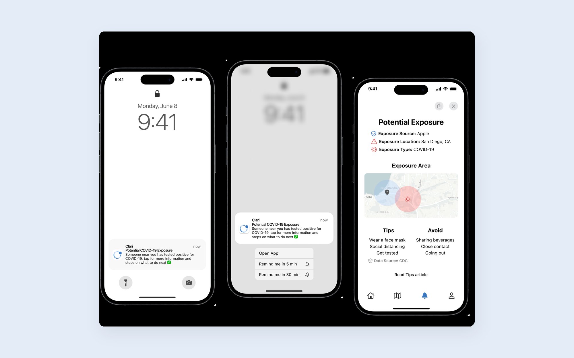
3 of 4 · Alerts
A notification opens to what happened, where, and a short list of what to do.
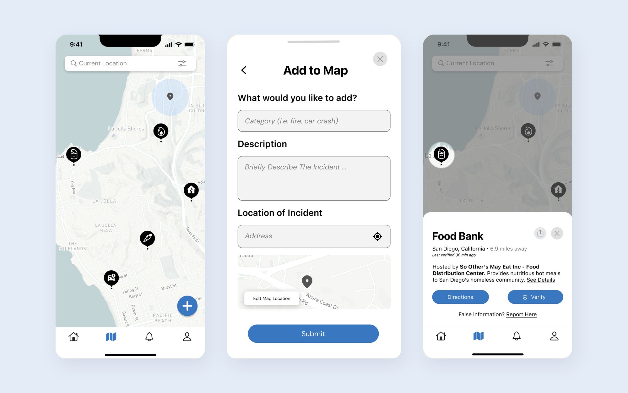
4 of 4 · Map
Find food banks or incidents nearby, report your own, and verify what others post.
Design system
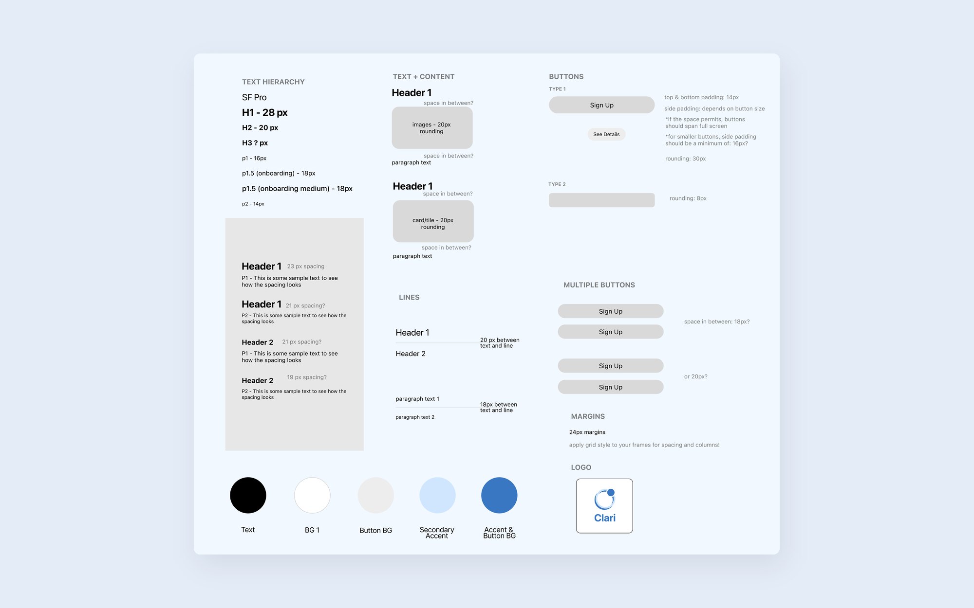
A limited palette of blue, black, white, and grey, checked against WCAG contrast and color-blindness tests.
Reflection
01
Most testers misread our tagline. Saying exactly what the app does fixed it.
02
Every round 1 tester struggled with map icons we thought were clear.
03
Thank you to my team, Happy Hub, and our mentor Dr. Eliah Spencer for their guidance.
