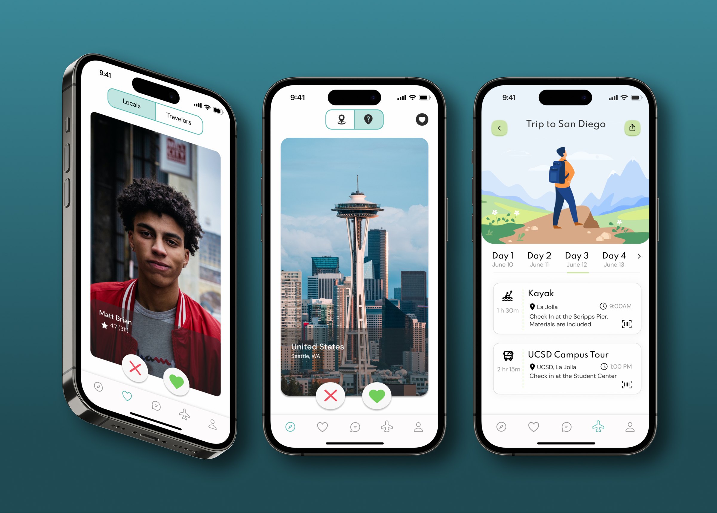
A budget-based travel app that pairs travelers with locals. Our team of five took it from idea to tested prototype in 10 weeks and won the UCSD Catalyst Award. I co-led UX/UI design and research, then redesigned the traveler side on my own as Jimoto 2.0.
5.07%
Landing page conversion rate for the winning A/B variant
826
Ad clicks from 4.67k interactions at $0.10 per click
1 of 4
Teams chosen for the UCSD Catalyst Award, out of 12 applicants
The solution
Jimoto builds day-by-day plans around a traveler's budget and timeframe, using recommendations from locals.
Travelers swipe through locals and fellow travelers at the same destination and dates, then chat to connect.
Destinations and activities are picked by swiping and added to one itinerary that fits the traveler's budget.
Flights and hotels are booked in the app and land in the same itinerary, so there's no juggling five tabs.
Problem
Travelers piece trips together across booking sites, maps, and their own research, and still end up seeing a place like a tourist. In 2023, 62% of travelers said a trip felt "wasted" if they didn't experience the local culture.
How might we help travelers plan a trip that fits their budget and connect with locals, without piecing it together across a dozen apps?
Research
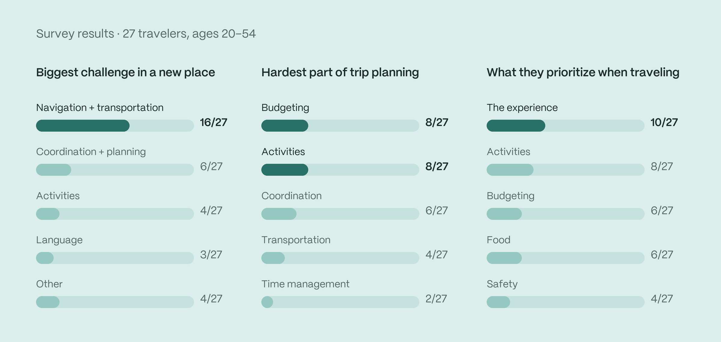
We surveyed 27 travelers aged 20 to 54, then interviewed them using storyboards. 12 of them spend 3 to 5 hours planning every trip.
16/27
said navigation and transportation were their biggest challenge in a new place
8/27
named budgeting as the hardest part of planning, tied with finding activities
10/27
prioritize the experience above everything else when they travel
“The [travel] apps are usually generic and they make you experience the culture like a tourist and not a native.”
Participants used Google Maps for directions, Klook for tours, and Google My Maps to plot their itineraries. No single tool followed the whole trip.
The "trip with friends" storyboard resonated most. One participant had just coordinated 10+ family members flying in from different countries.
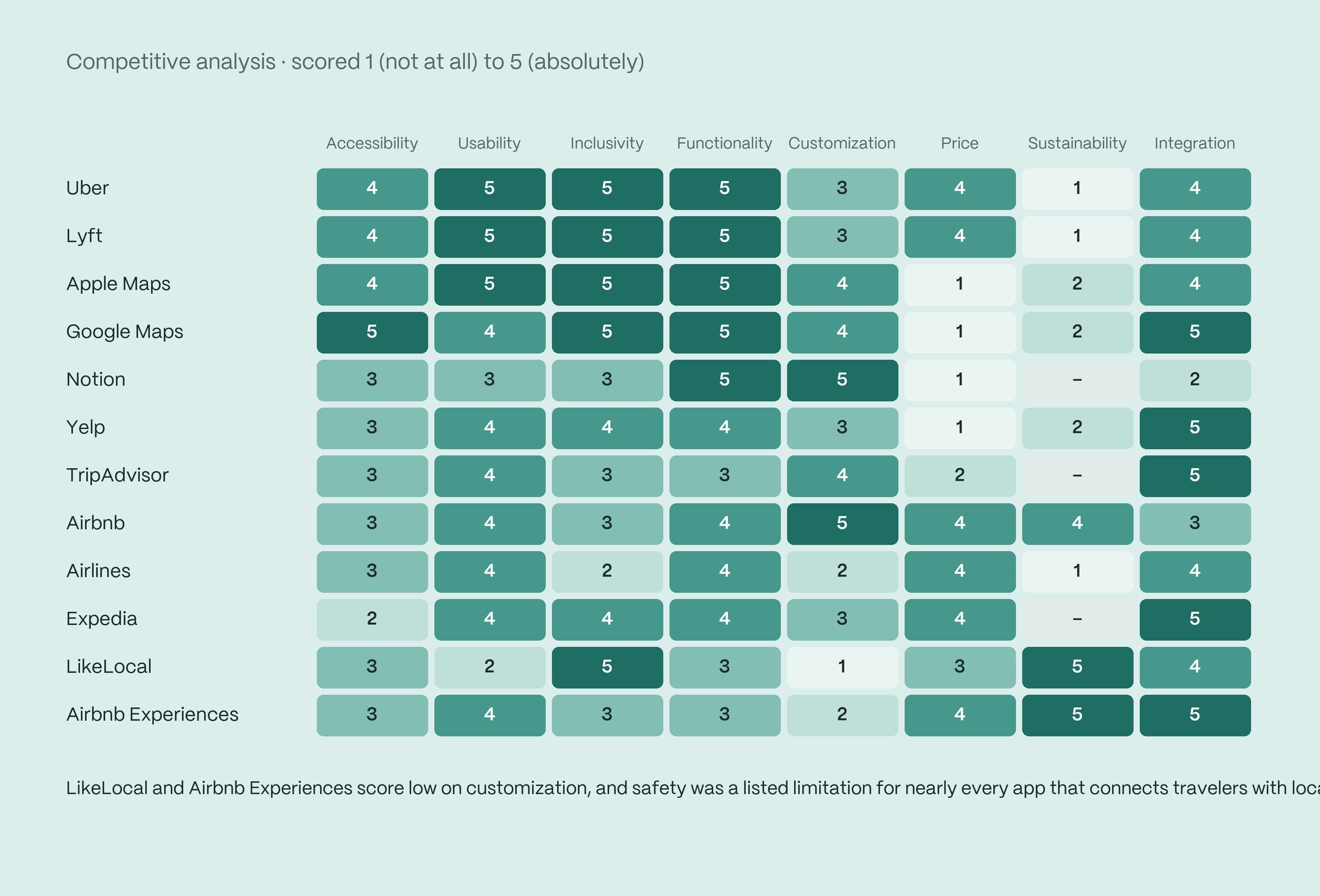
We scored apps like Google Maps, TripAdvisor, Airbnb Experiences, and LikeLocal on 8 criteria. None combined budget planning, booking, and safe connections with locals. That gap became Jimoto.
Design process
We brainstormed 8+ concepts and kept the two our research backed most: budget-based itineraries and meeting locals. I mapped the traveler's flow, then we turned whiteboard sketches into lo-fi wireframes and a concierge MVP to test.
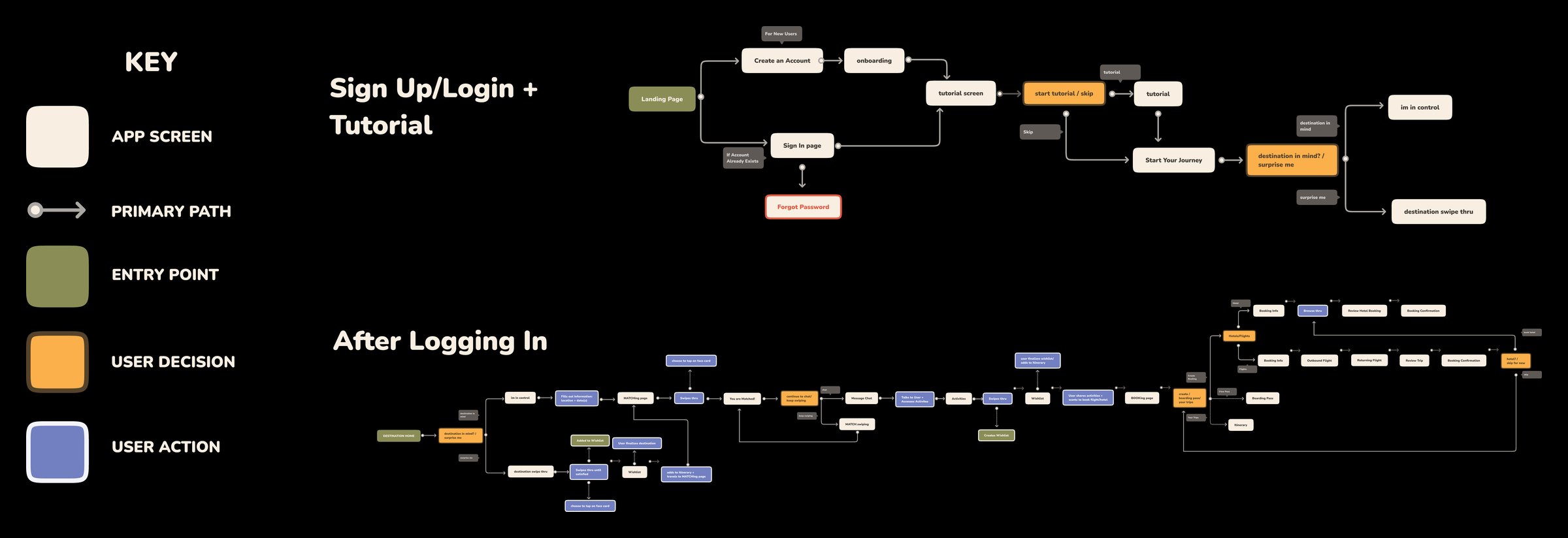
1 · User flow
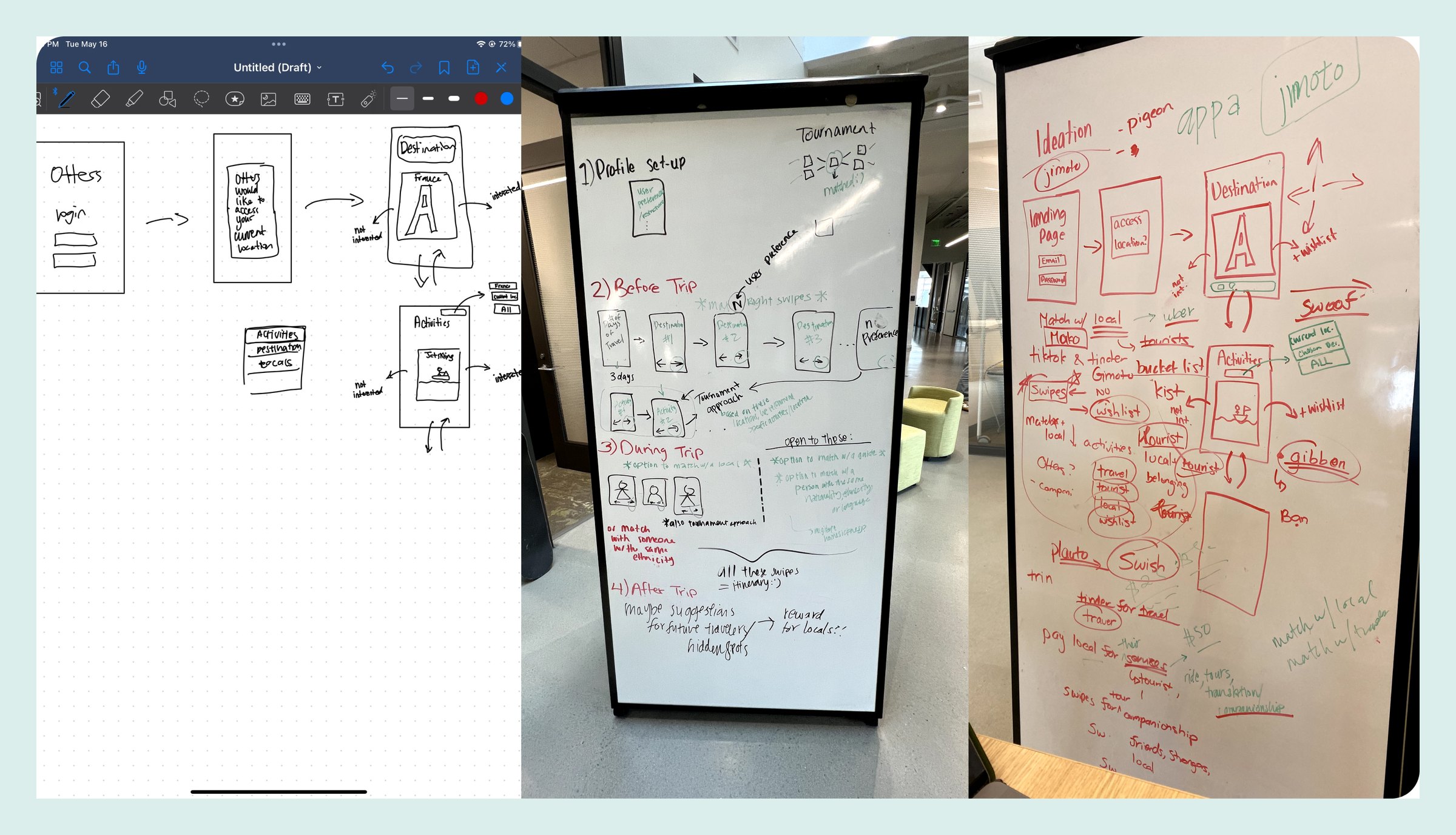
2 · Whiteboard sketches
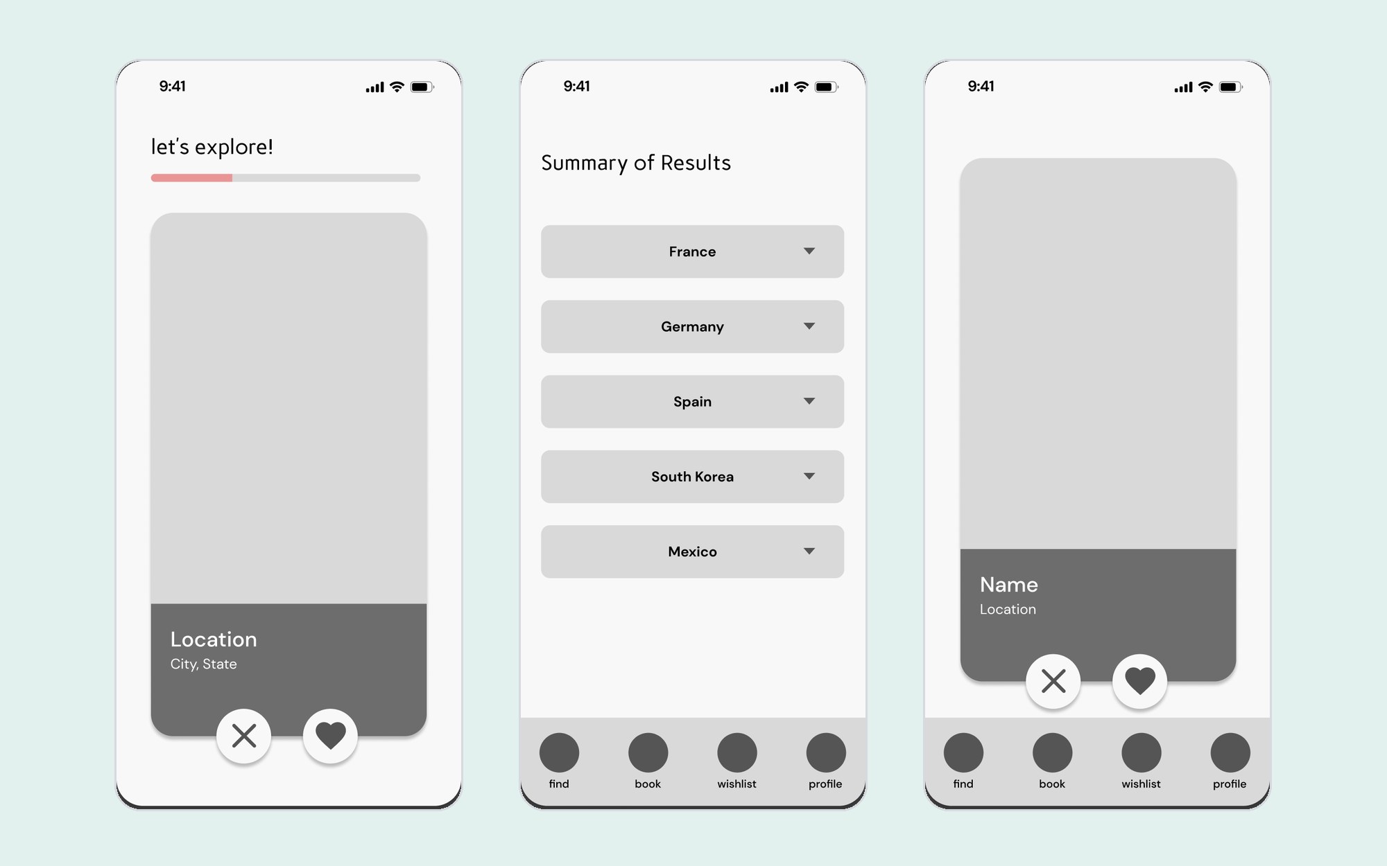
3 · Lo-fi: explore
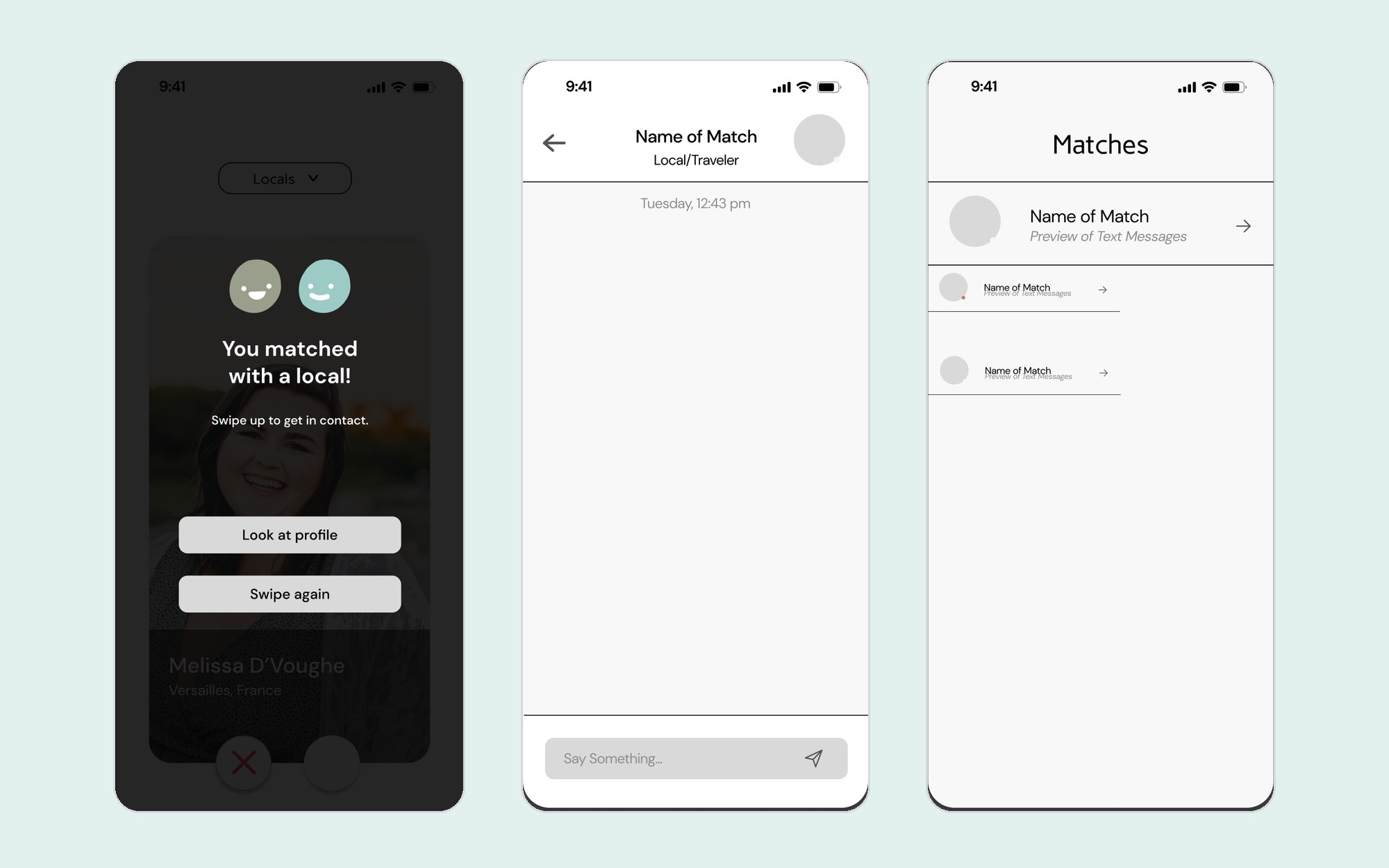
4 · Lo-fi: match and chat
Usability testing
We put our first version in front of travelers and locals, with a stronger focus on the traveler side. The feedback was consistent: the app tried to do too much at once, and meeting a stranger needed to feel safer.
What locals said
A separate app for locals might work better, and safety needed a lot more emphasis.
What travelers said
The app felt chaotic, and connecting with a local needed to be friendlier, smoother, and safer.
How might we make Jimoto feel calmer, and make meeting a local feel safe?
One task per screen, bigger visuals, and fewer competing controls.
Show ratings, reviews, and what a local offers before anyone connects.
Locals suggested having their own app, so the redesign focuses on the traveler side.
Iteration
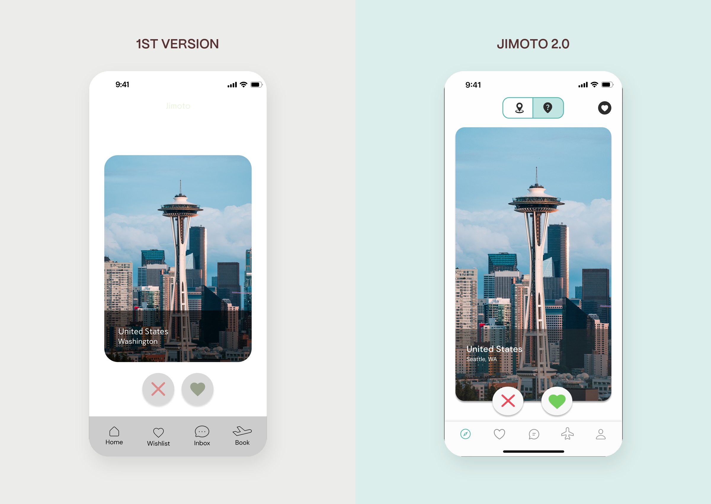
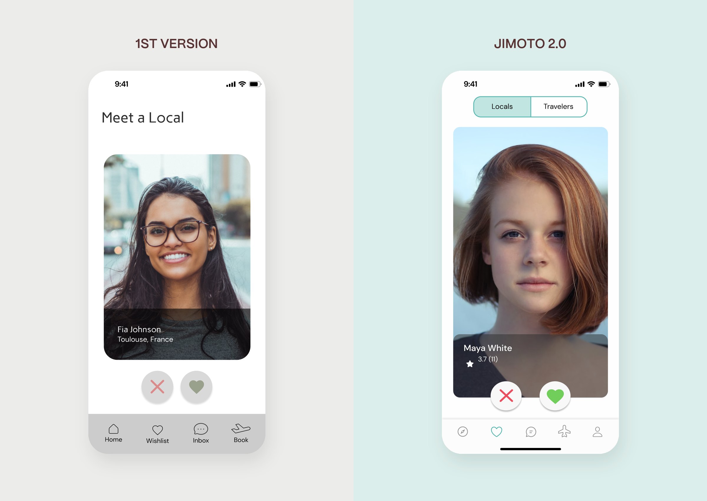
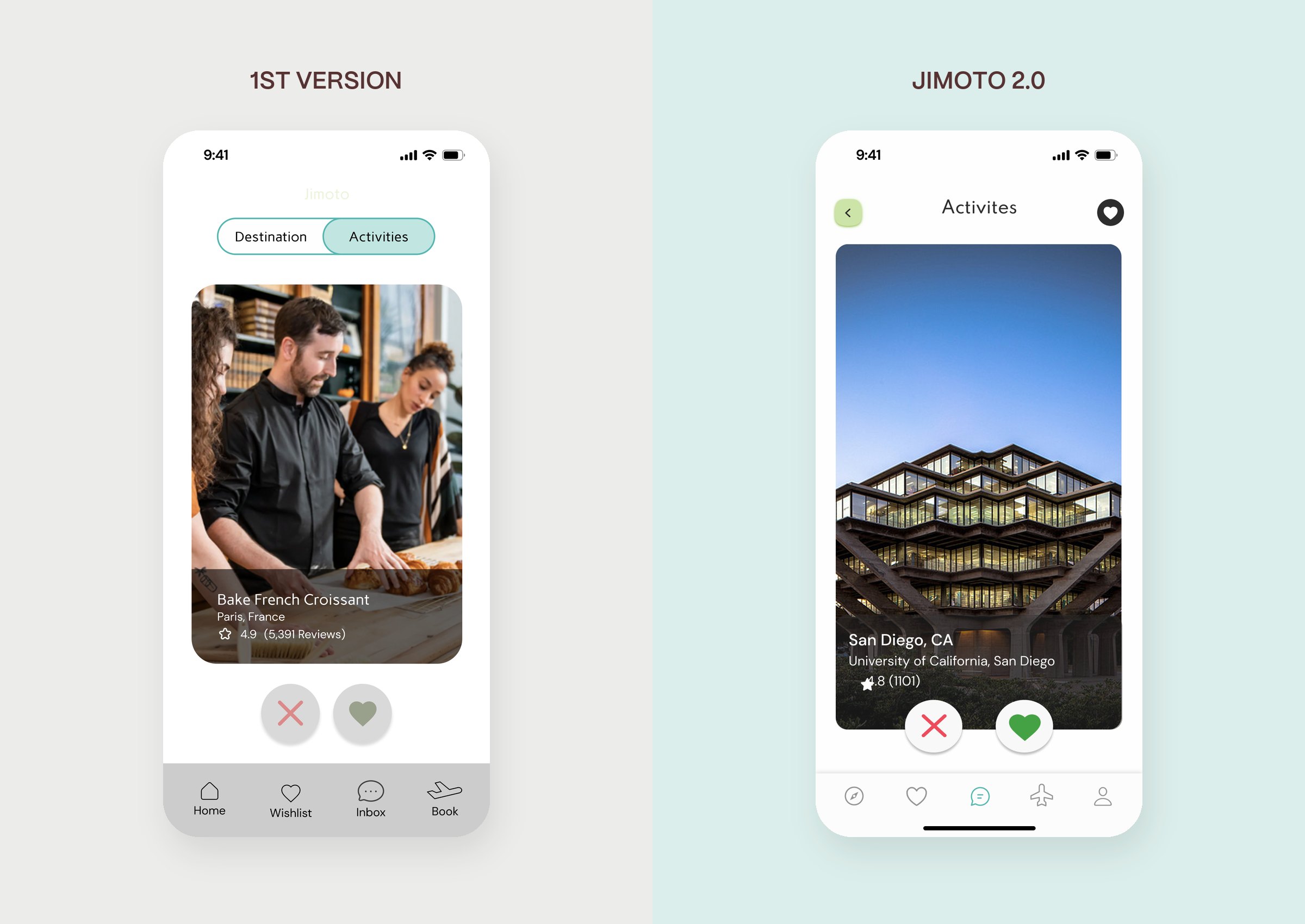
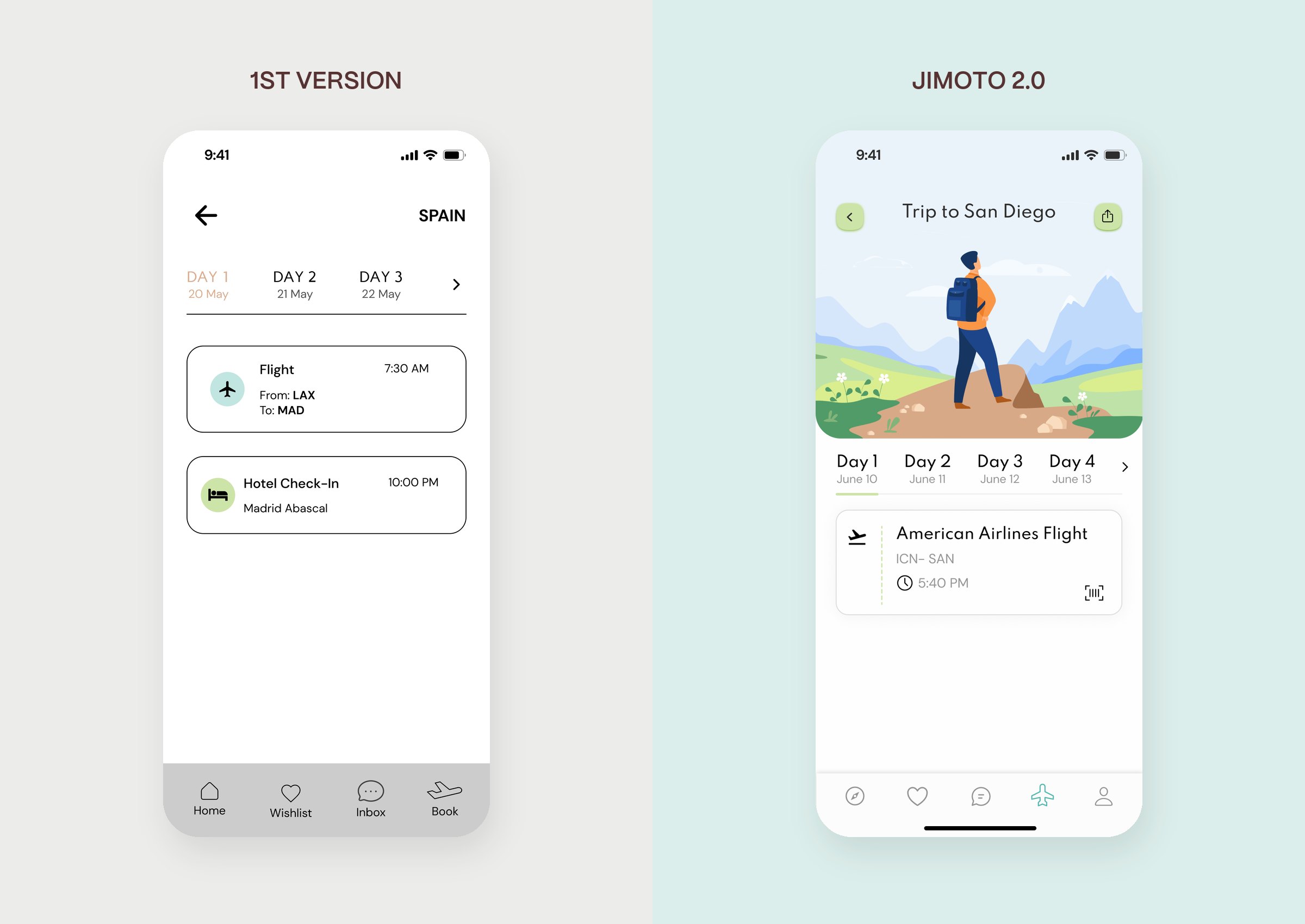
After the class ended, I wasn't happy with our colors or how some screens felt, so I redesigned the traveler side on my own using the testing feedback. Here are the same screens, side by side.
The first version floated a small photo in a mostly blank screen. In 2.0 the card fills the screen, the swipe buttons sit right on it, and a toggle lets travelers type in a destination they already have in mind.
Testers wanted connecting with a local to feel safer. In 2.0, every local shows a star rating and review count, and one toggle switches between locals and fellow travelers.
The first version mixed destinations and activities behind one toggle, which added to the chaotic feel. In 2.0, activities get their own screen with the location and rating on every card.
The trip plan gained a friendly header, day tabs with dates, and cards that show the route, time, and a scannable ticket, so travelers can check their day in seconds.
Final design
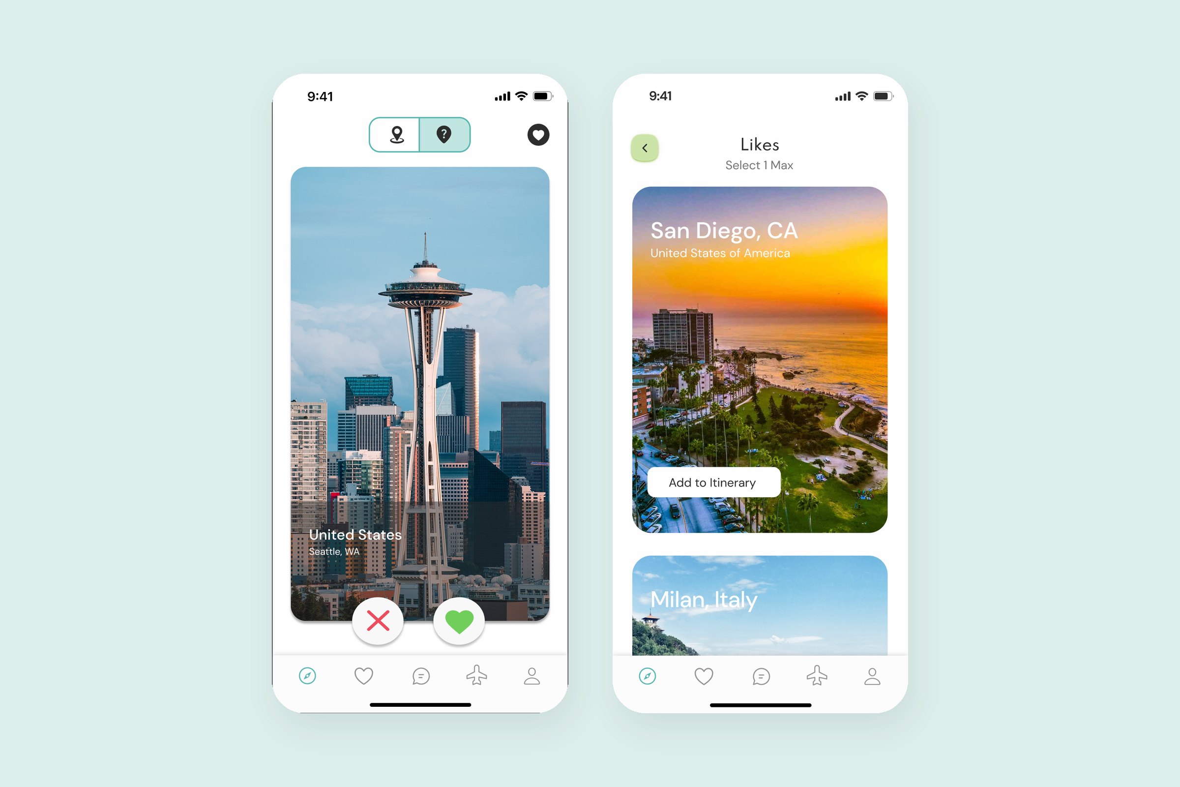
1 of 5 · Destinations
Swipe right on places you'd love to visit, then add a favorite to your itinerary.
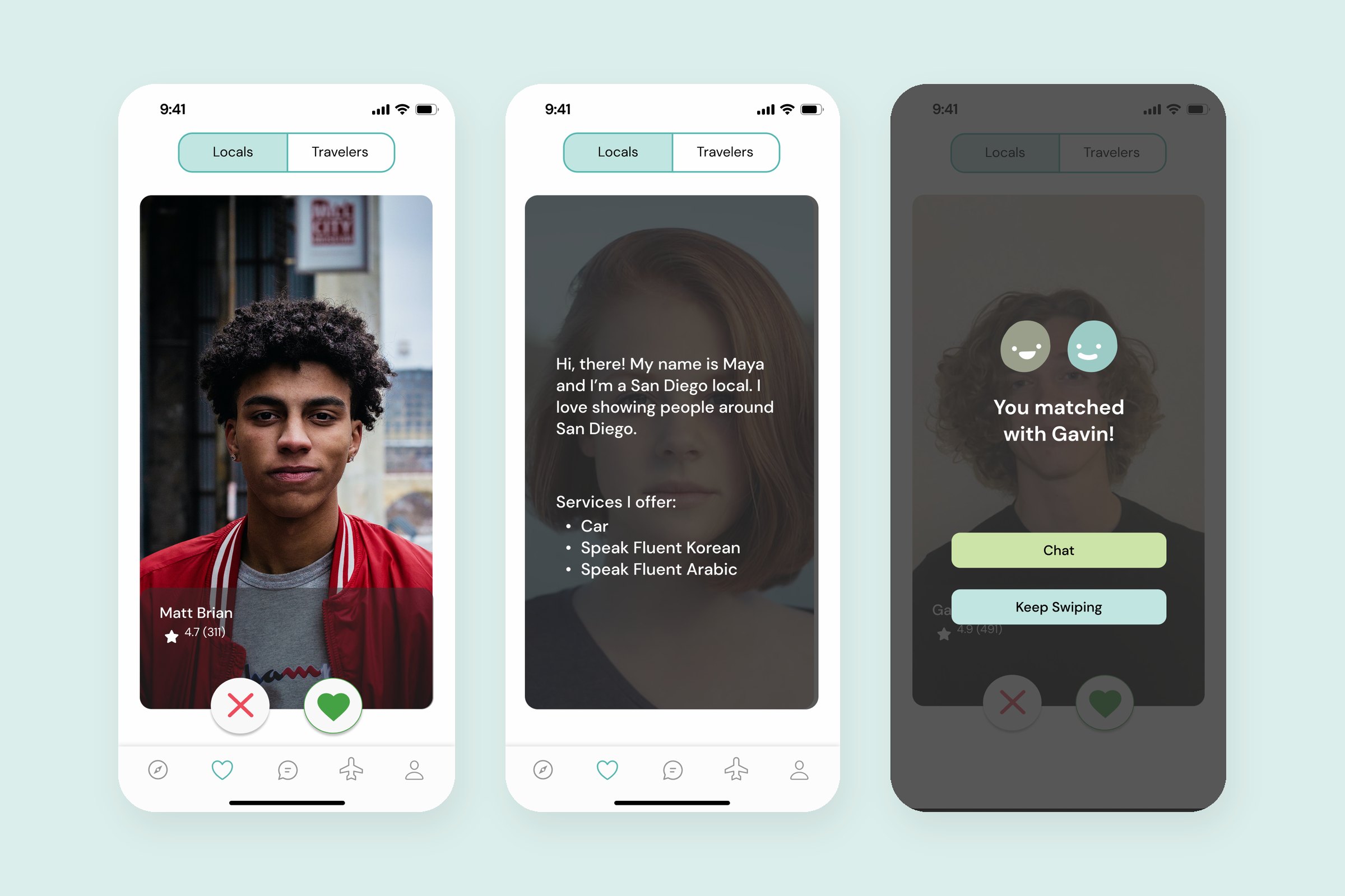
2 of 5 · Locals
See what each local offers, like a car or speaking your language, then match to chat.
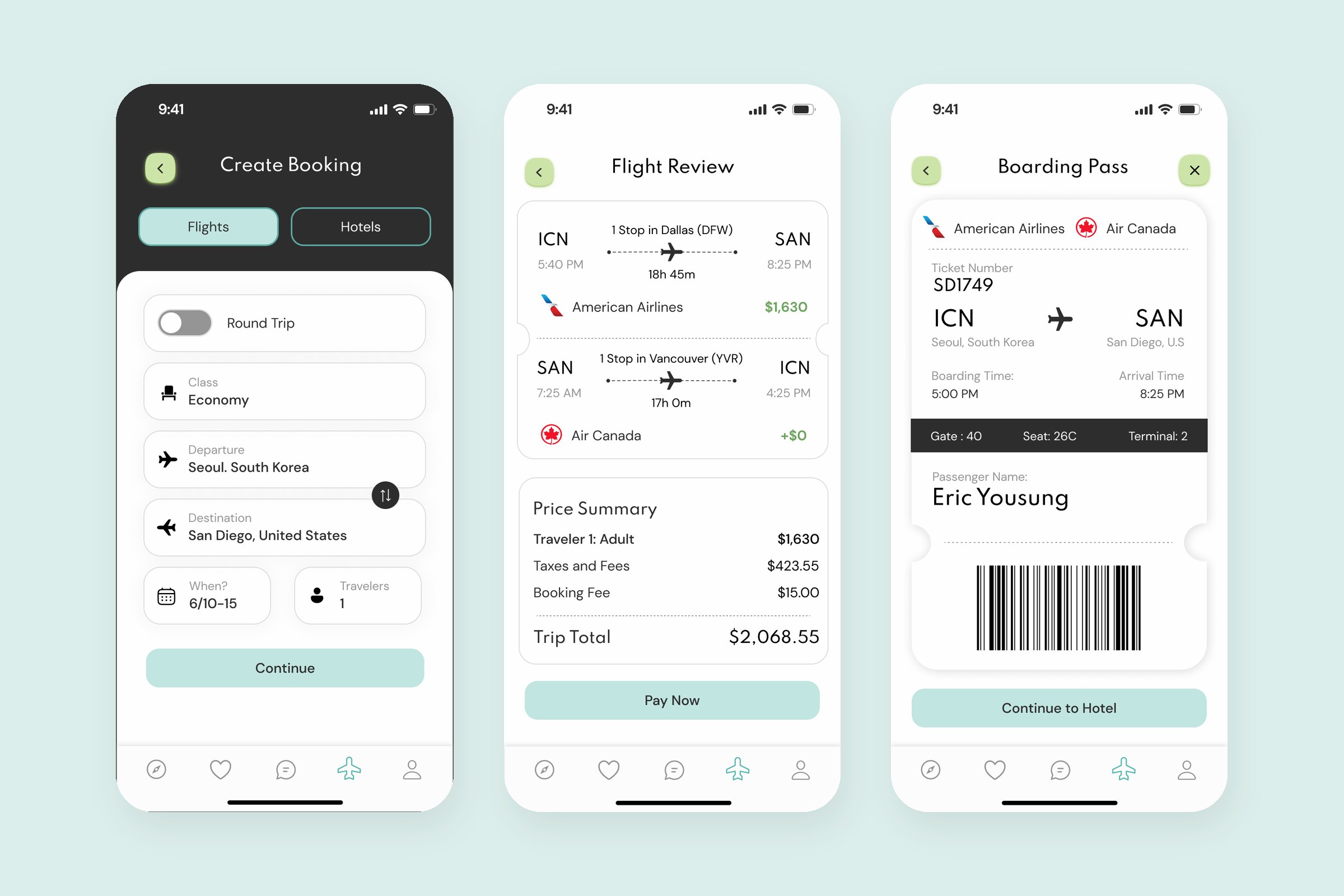
3 of 5 · Booking
Search, compare, and book without leaving the app.
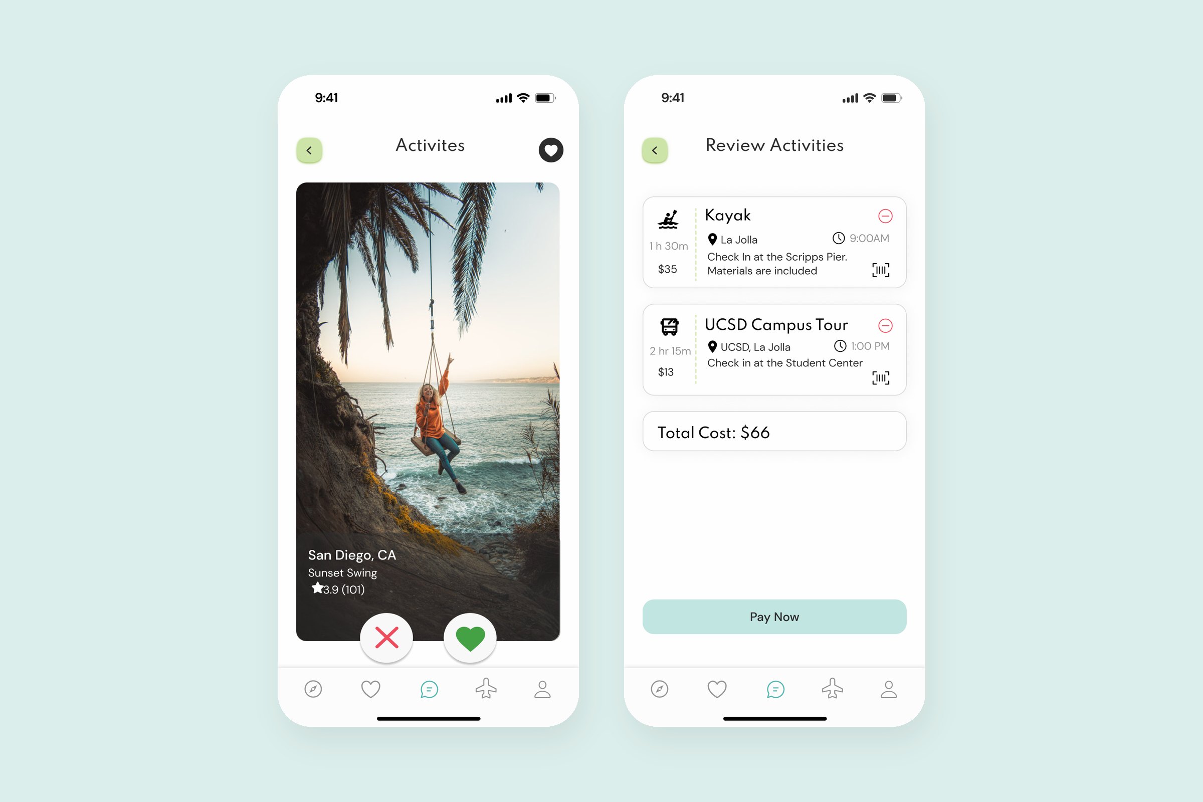
4 of 5 · Activities
Each price and a running total stay visible before paying.
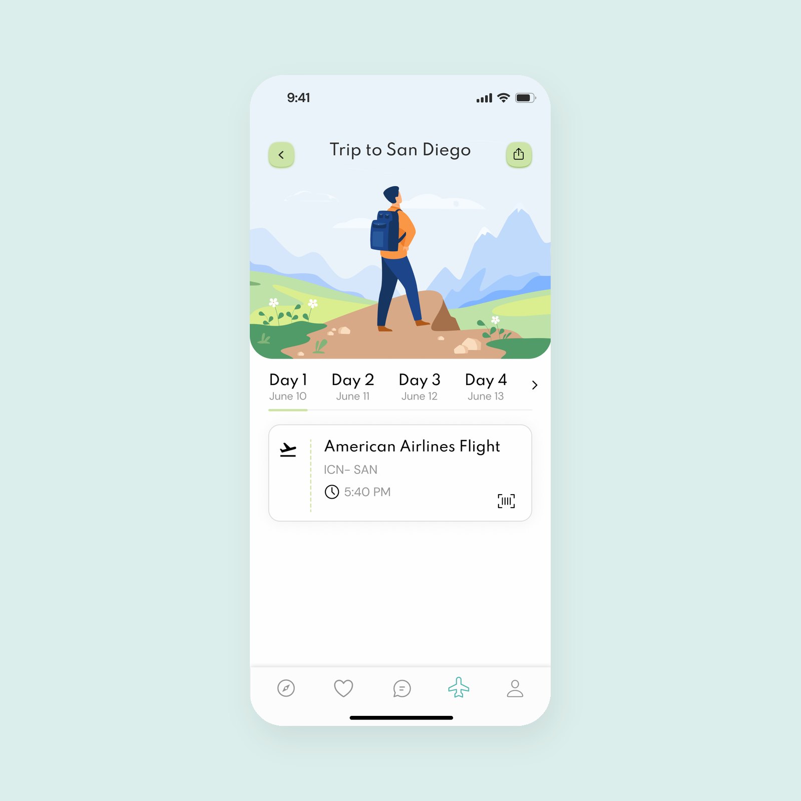
5 of 5 · Itinerary
Flights, hotel, and activities come together by day.
Want to click through the flow yourself? View the Figma prototype →
Validation & outcome
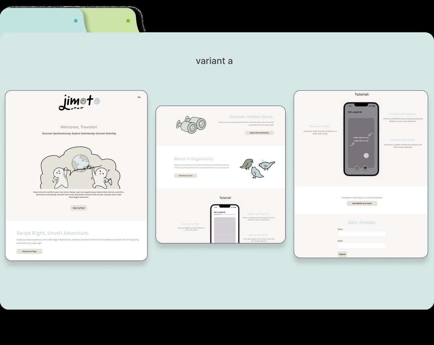
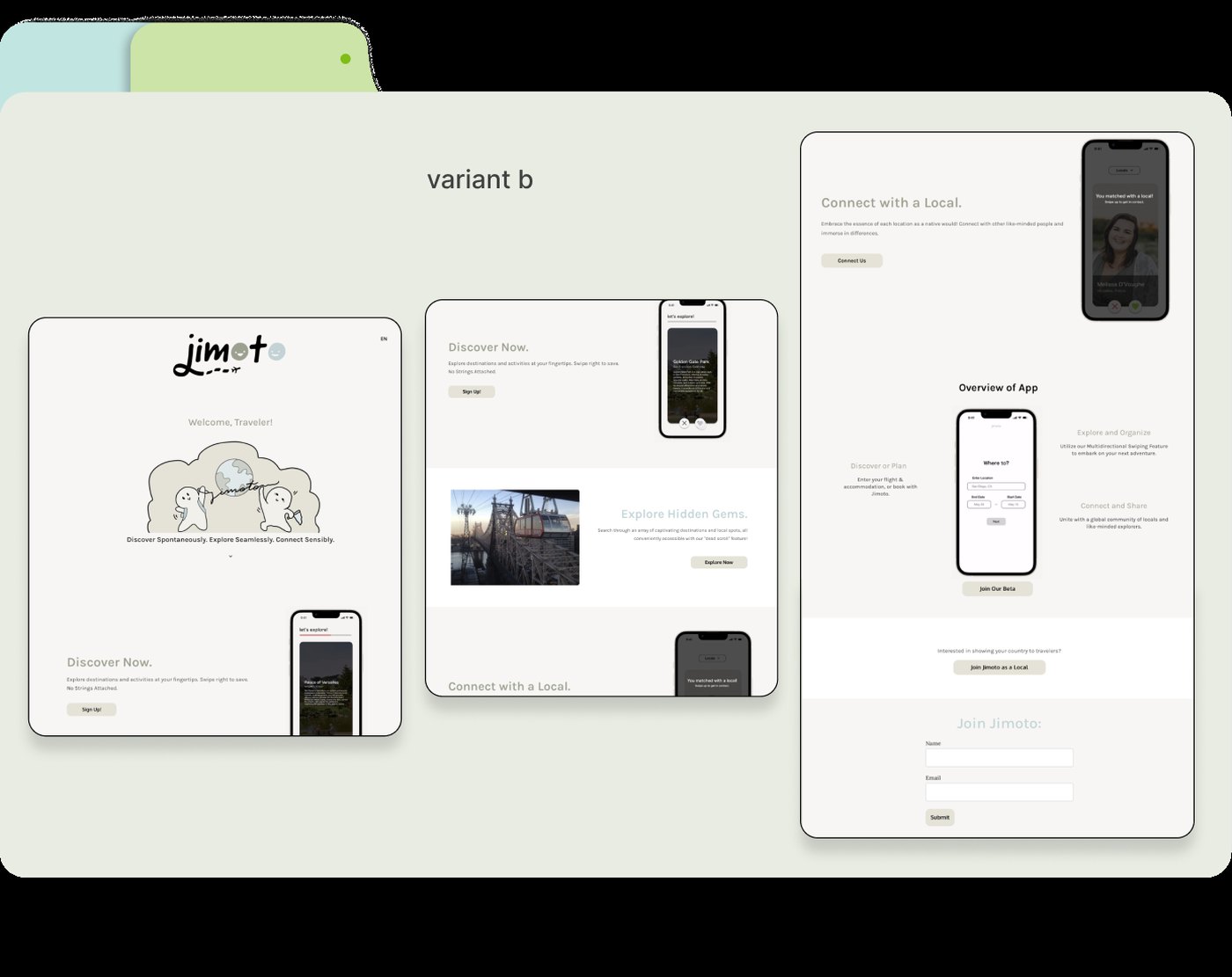
We A/B tested two landing pages in Unbounce. Variant A, a simple overview, beat the prototype deep-dive with a 5.07% conversion rate.
Variant A · winner
Variant B
Our Google ad earned 826 clicks at $0.10 each, and the top search terms confirmed that budget and solo travel mattered most to our audience.
We were picked out of 12 applicants. Along the way I worked on every side of a startup: research, design, budgeting, marketing, and pitching.
Reflection
01
The A/B test taught us more about how to talk about Jimoto than another round of visual polish would have.
02
Any product that connects strangers has to design for trust from the very first screen.
03
I'd use AI to cluster our research into themes faster and explore more layouts before testing, while the decisions stay mine.
