Clari - Providing Clarity In All Situations

‍background πŸ“–

Project Overview

For this project I worked with my team Happy Hub at the UCSD Design Lab's Center 4 Health where we served as Design Consultants. We applied this community's principles into our own health related app that could be used to target the need for resources and clear information during crises and everyday scenarios.

Team:Doan D., Daniela A., Athena H., and Jessie L.
‍
Tools: Figma, FigJam, and Miro

Scope: UI/UX Design, User Research, User Testing, Interviews, and Pitch Presentation
‍
Timeline: April - June 2023

My Role: I worked as co-lead UX/Ul Designer and User Researcher for the development of the app. I helped conduct user research and also design the app interface.

the problem SPACE

Unforseen Situations can be challenging to overcome

We interviewed people and found out that people often have trouble knowing what to do in emergencies and even everyday unforeseen situations. We decided to create an app that would allow us to provide people with timely, clear and reliable information to overcome times when they are in lack of accessible resources and information.

competitive analysis

the competitors aren't effective

To start understanding the big picture and the problem, I examined products with similar goals in mind like : Citizen, Waze, and Apple's Emergency Alerts.
We learned that while these apps are similar in the goals we wished to address there were a few things they weren't doing. Most of these apps lacked clear digestibility and most importantly it doesn’t provide users with clear tips or suggested next steps.

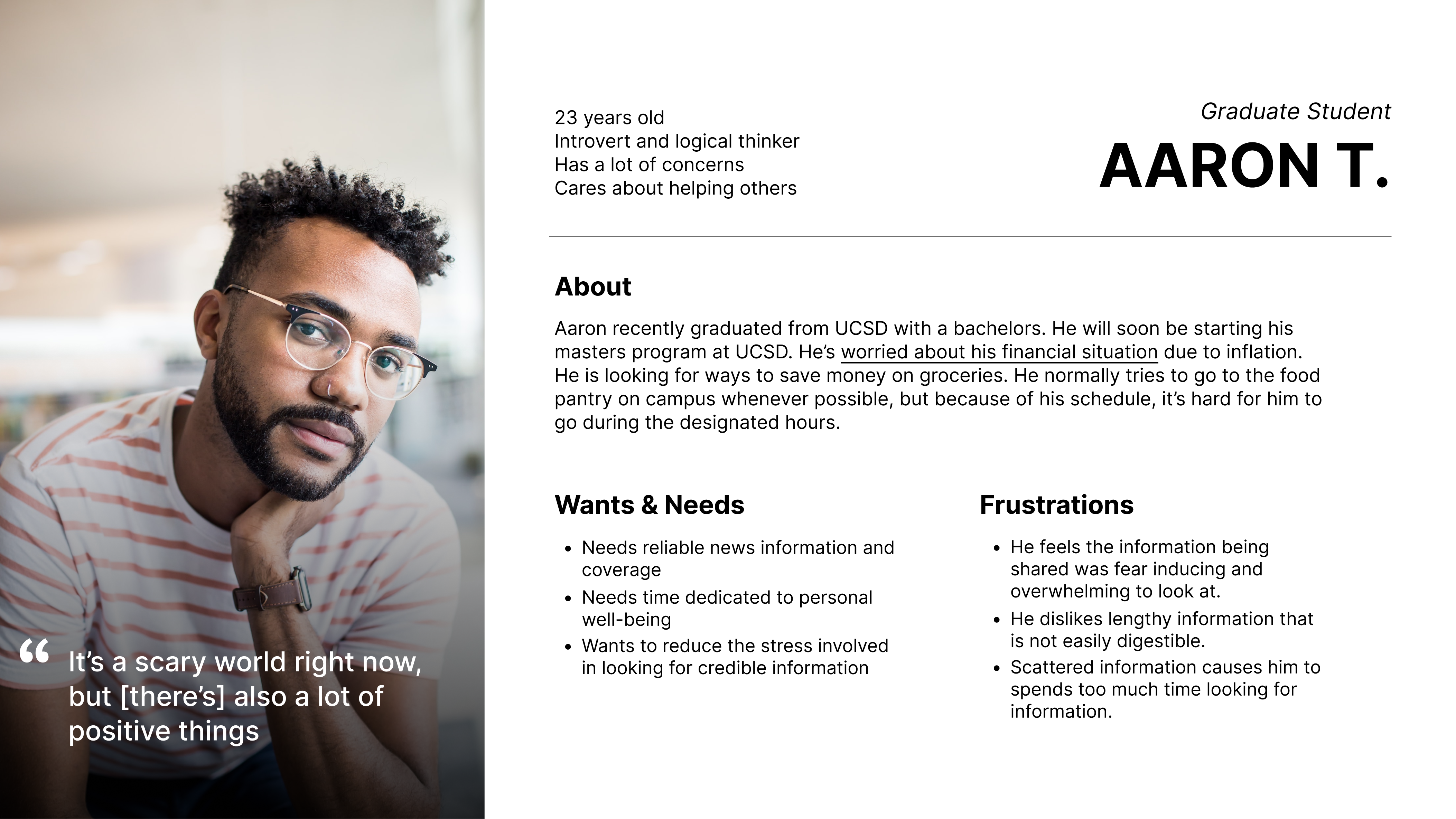
user research + user persona

we interviewed 15 people and this is what we found

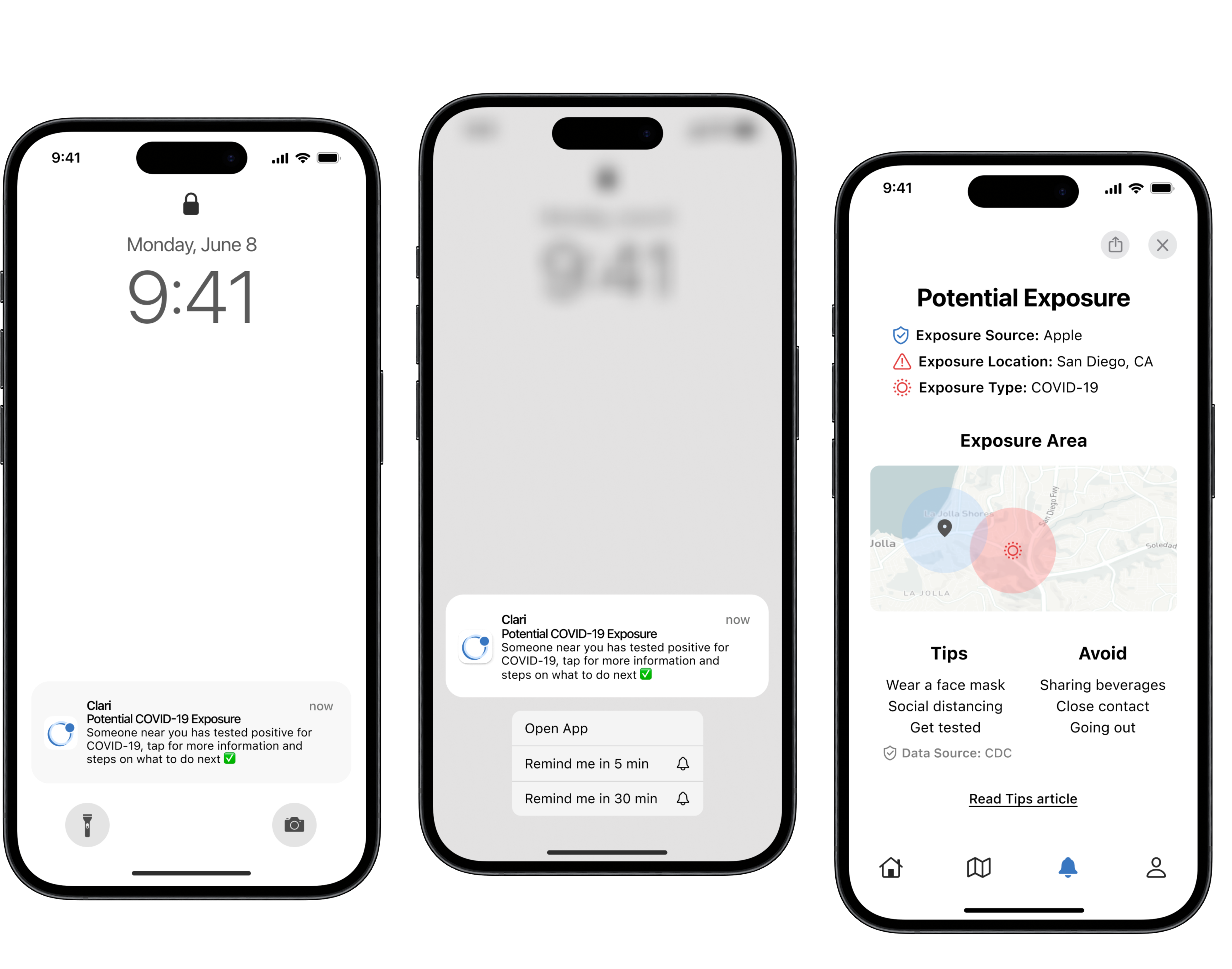
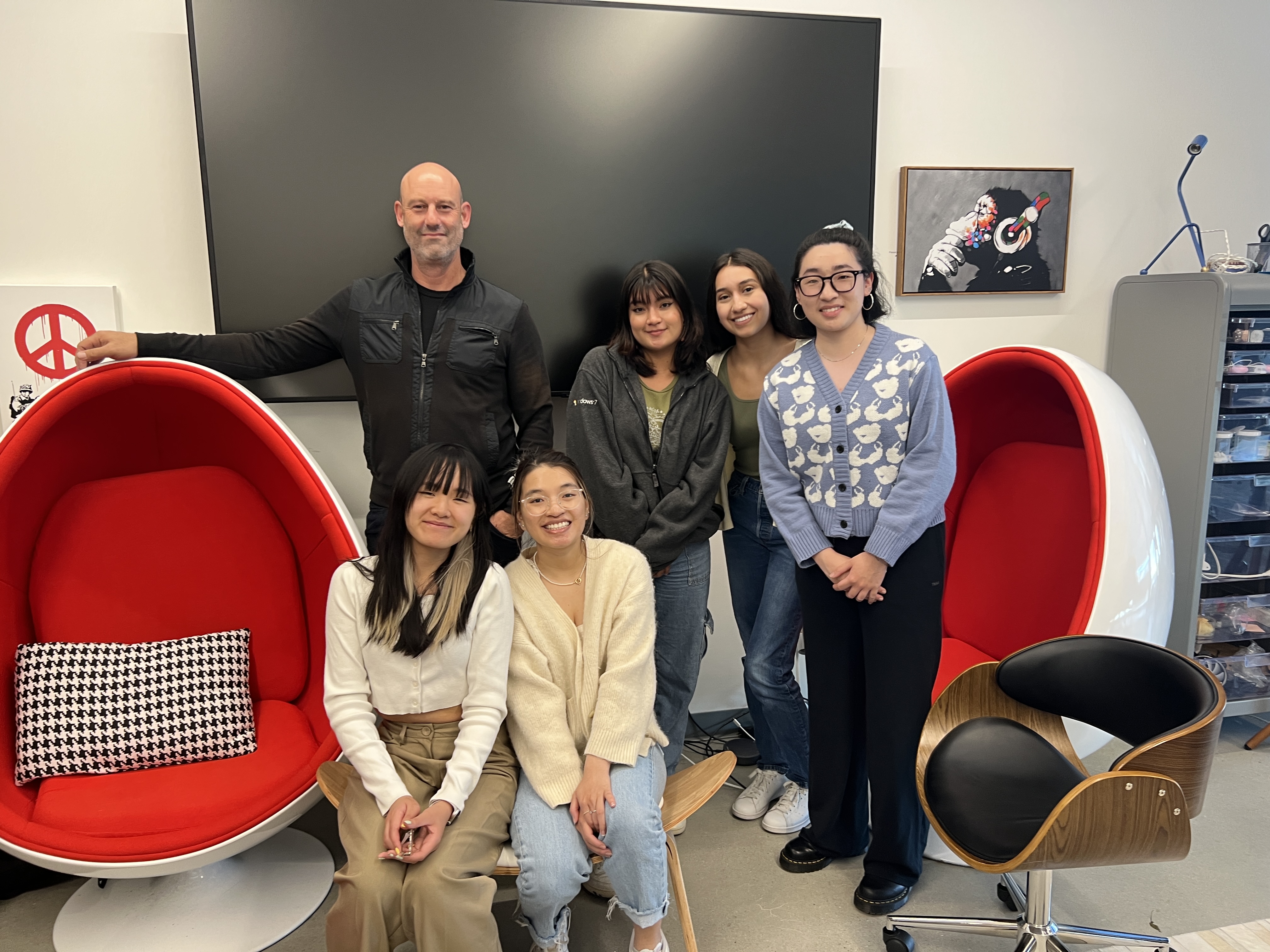
To understand the bigger picture we needed to gain a deeper understanding of how people navigate through tough times using the outbreak of COVID-19 as a reference point. The interviewees included a diverse range of individuals from high school students to university faculty/staff and this was done through convenience sampling. Through these interviews, I observed reoccurring answers and took note of common pain points and using this information we created a persona.

πŸ‘₯ 55% of interviewees stated that they use a social media platform and notifications to stay up to date on recent events
πŸ‘©πŸ½βš–οΈ 85% of interviewees use government trusted sites to get reliable and trustworthy news information
πŸ₯¬β›‘️ 74% of interviewees exclaimed that they've experienced struggling to get access to everyday resources like food

problem statement + key features

how might we Design a resilient service that provides credible, timely information to address the public's basic and personal needs in an empathetic matter

Using what we learned we decided that the key elements we wanted to include in our design would improve community resilience by connecting people with local resources and providing timely emergency alerts. More specifically, this can be split into 4 categories: public (community) health, notifications, personal health, and everyday needs.

information architecture

so how is this app going to work

Our team organized our app idea into an information architecture model in order to visualize how the app would move smoothly for the user. Along the way we kept the limitations into consideration while making sure we met our design goals which were: create a easy and seamless user interface experience, avoid lengthy text , and include a community map to show available resources in their area.

lo-fi + mid-fi sketches

Then to understand how
things are going to look I turned to sketching

We got together to draft out sketches for the following screens: notification pop-up + follow-up detail screen, onboarding, home screen, profile set-up would look like.

mid-fi wireframes

Prepping for 1st round of user testing


We used the lo-fi sketches we made and created wireframes on Figma to begin our first round of usability testing on 8 users. To test them we created 5 user scenarios with follow up questions on their experience.

Another thing we wanted to keep in mind while testing was if the user could do the following:
Could users identify what the app was about?
Could users identify what the different icons on the map mean?
Could users easily navigate through the app & understand the information provided for emergencies?

User testing results + improvements

The results from our first session of user testing revealed to us that: Β 

Change App's Opening Screen

From 6/7 of our users we received feedback that our app's mission was "confusing" due to the tagline

Getting Rid of Useless Tapping

After examining feedback we found that we had excessive buttons/screens so we removed the section where the recent and old notification history were separated and combined it into one.

Confusing Map Icons + Wording

One of our questions for the user testing gauged the user's interpretation of the map icons. 7/7 users were confused on the meaning of some of the icons, therefore we changed them and added a hover effect that provides a clear resource title.

2nd round of user testing

we needed to do another round of testing to solidify improvements

We interviewed 5 new users and their thoughts solidified our need for our previous changes. 4/5 users felt that the app was easily understood and straightforward with minimal need for help.
However, we still received feedback that there were still some minor changes that we needed to adjust (eg font size, placement).

final prototype

our final product incorporated all user testing feedback

Sign Up + Onboarding

During user sign up we gave them the option to connect existing "health" apps and profiles to their account and to allow push notifications.

Homescreen Customization

An important aspect for our mission was to give the user a sense of personalization so we gave them questions to best customize their home screen and Clari experience. They were able to select topics they were interested in learning more about and sensitive topics to hide from their feed.

Map + Incident Reporting

We wanted our users to be able to find things going on around them ranging from all things important like where to find the closest food bank to the nearest traffic accident. We also provided a way for them to report their own incident/resource and verify it/check for verification.

Push Notifications

Another part of our mission was to give the user timely and useful information on an emergency alert and how to deal with it by making it easily digestible through a list of steps.

brand + style guide

branding clari

final thoughts

an amazing experience + team

I want to give a special thanks to my team Happy Hub and my wonderful mentor Dr. Eliah Spencer for being truly the best professor and friend who gave insightful and meaningful advice along the journey. I learned so much from this experience and I was grateful to have so many inspiring designers working alongside me.