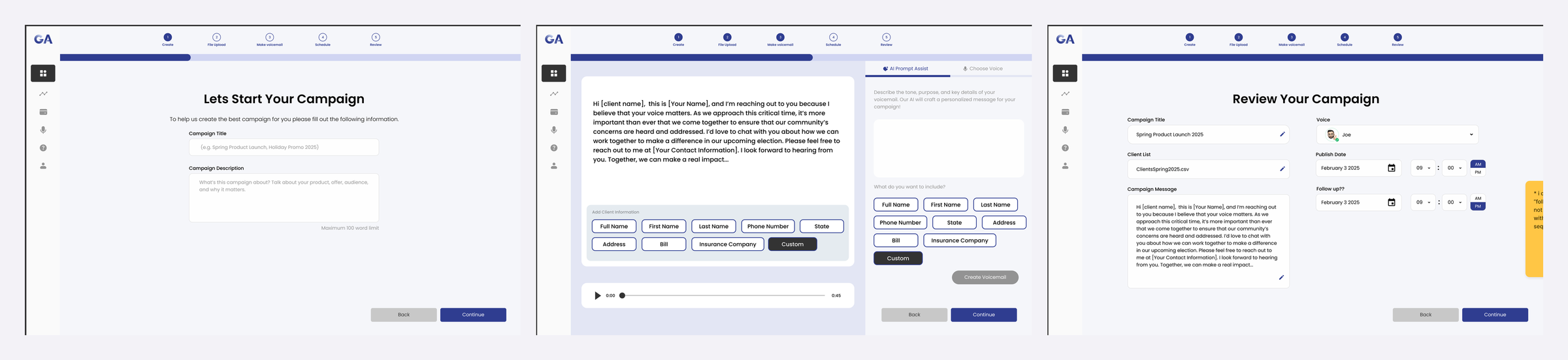
Gabriel AI lets businesses record one voicemail and send personalized versions to hundreds of contacts. On a four-person design team, I designed the end-to-end campaign creation flow, including the step where users review AI-written messages before anything goes out, and led the rebrand and landing page redesign. Some details are left out for confidentiality, and screens use placeholder data.
#9
Product of the Day on Product Hunt at launch
125
Upvotes on launch day
10
Usability test participants I ran sessions with
Problem
The website gave visitors almost no context, and inside the product, creating a campaign meant juggling contact lists, scripts, voices, and schedules without a clear path. And because AI writes the message, users needed a way to check it before it reached real people.
How might we help first-time users launch an AI voicemail campaign they feel confident sending?
Audit
Visitors couldn't tell what Gabriel AI does, or why it beats calling or emailing.
No product screenshots or demo, and testimonials with no results attached.
The navigation disappeared on scroll, there was no footer, and the main call to action didn't stand out.
Campaign flow
I split campaign setup into Create, File Upload, Make Voicemail, Schedule, and Review, so each screen asks one question at a time.
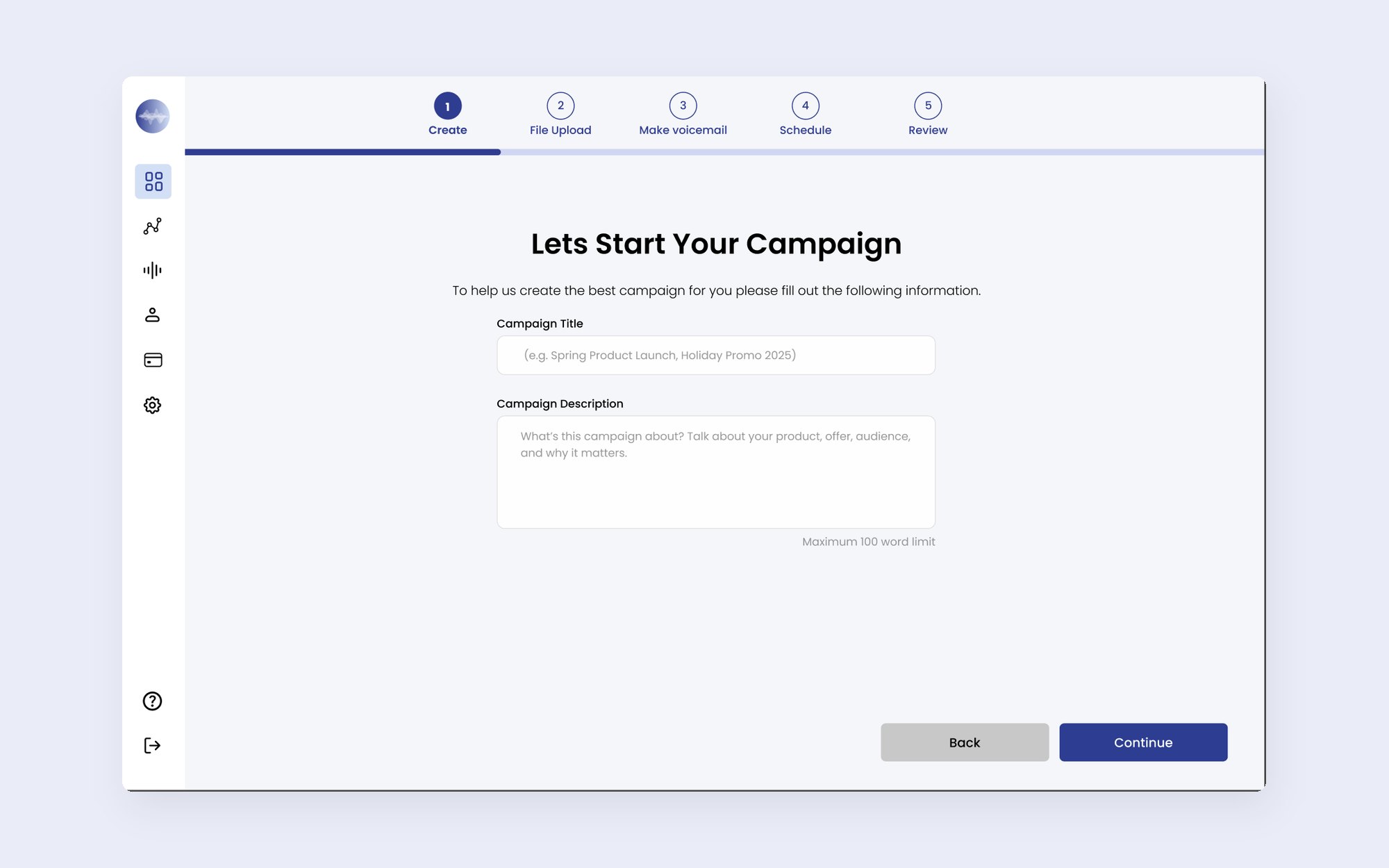
Step 1 of 5 · Create
One question per screen, with a progress bar that's always visible.
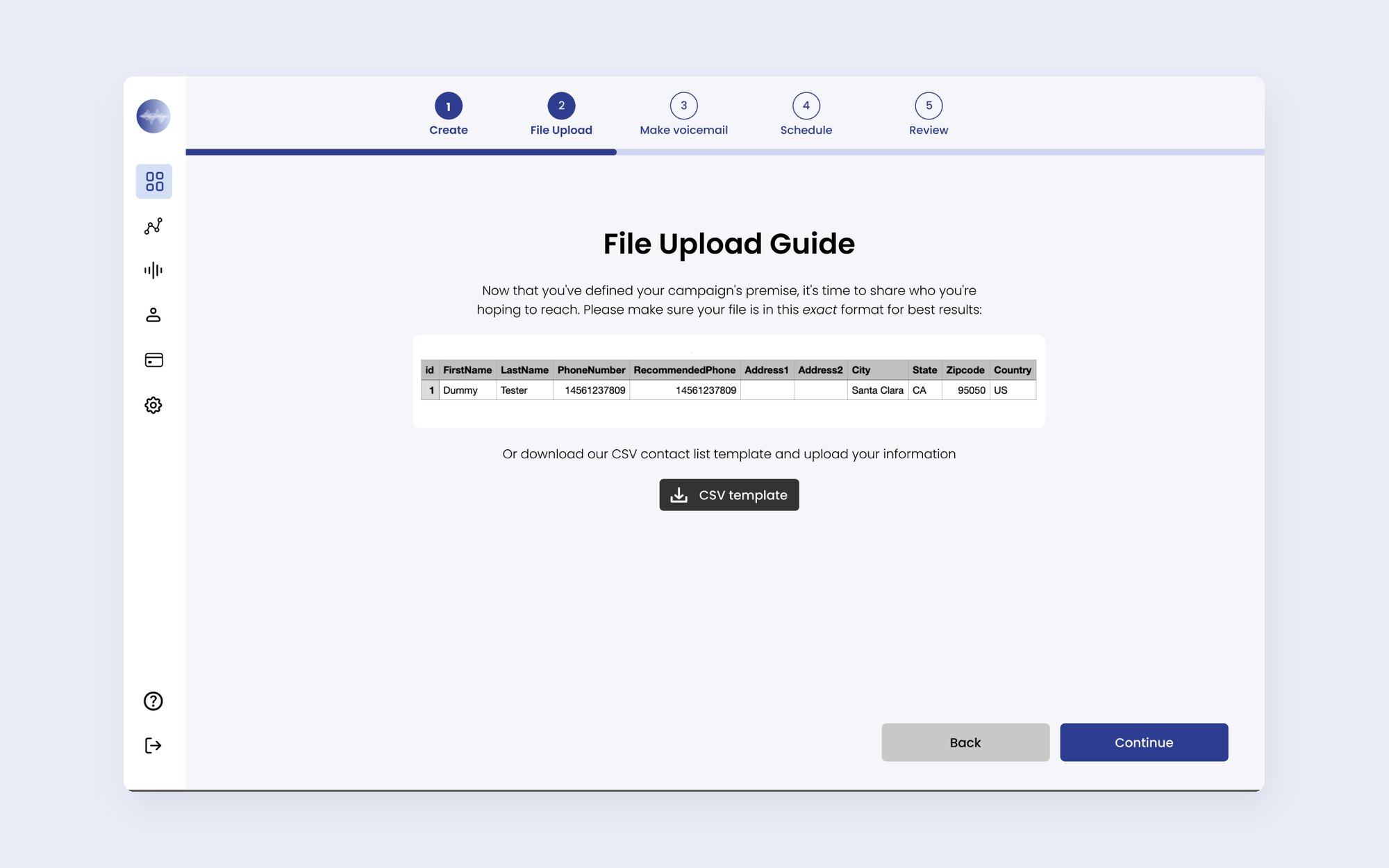
Step 2 of 5 · File upload
A guide and CSV template head off a common source of errors.
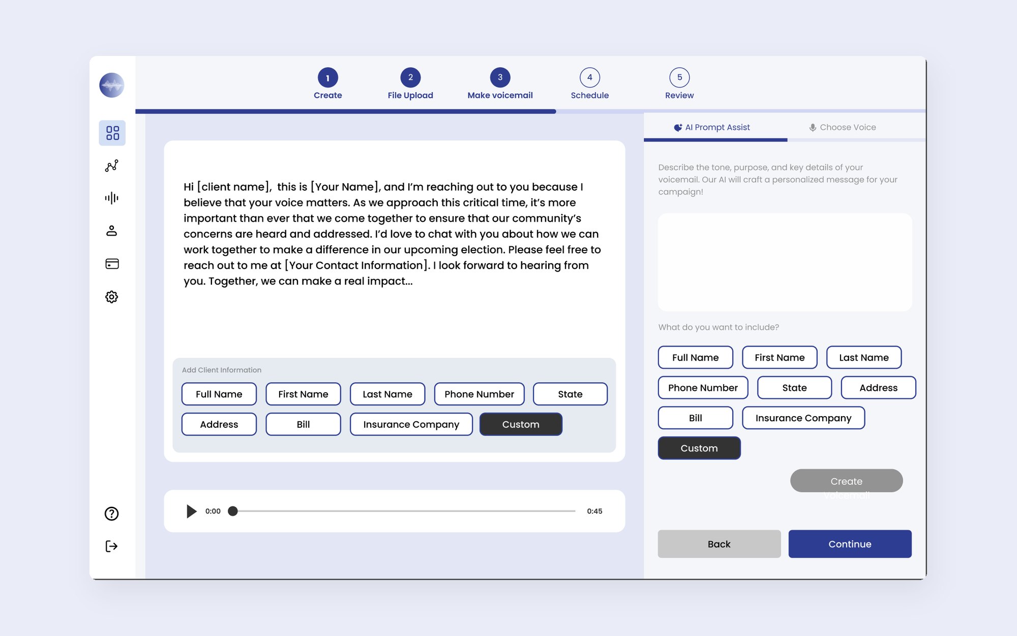
Step 3 of 5 · Make voicemail
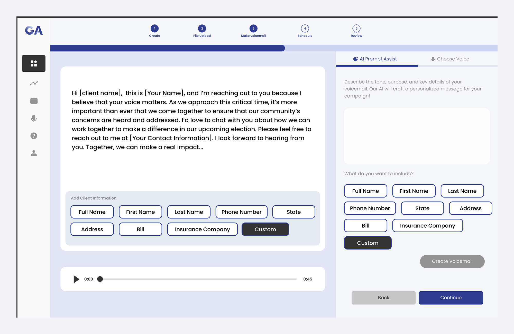
AI Prompt Assist writes the script, and chips insert details like a client's first name.
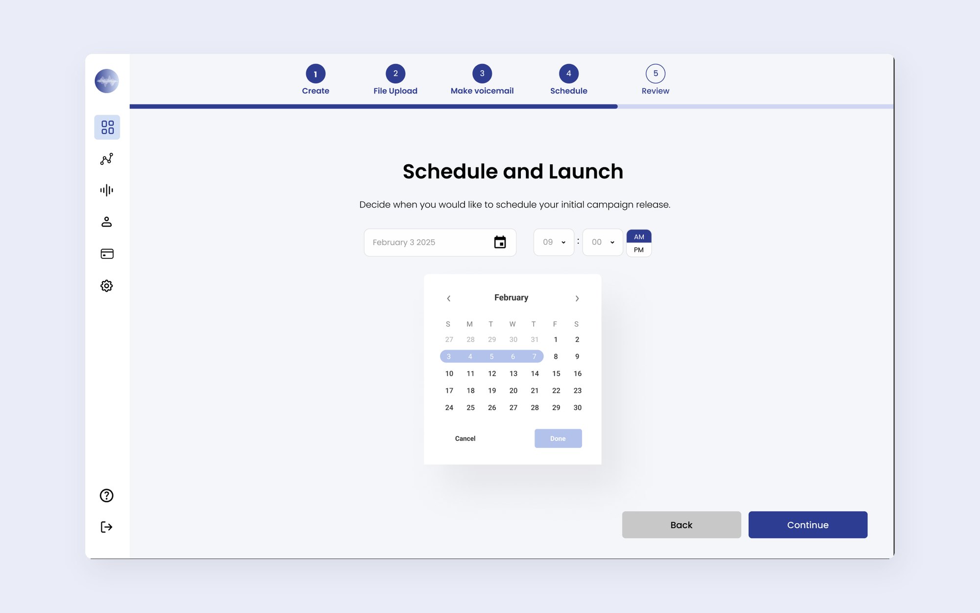
Step 4 of 5 · Schedule
Choose a launch date, then optionally add an automatic follow-up.
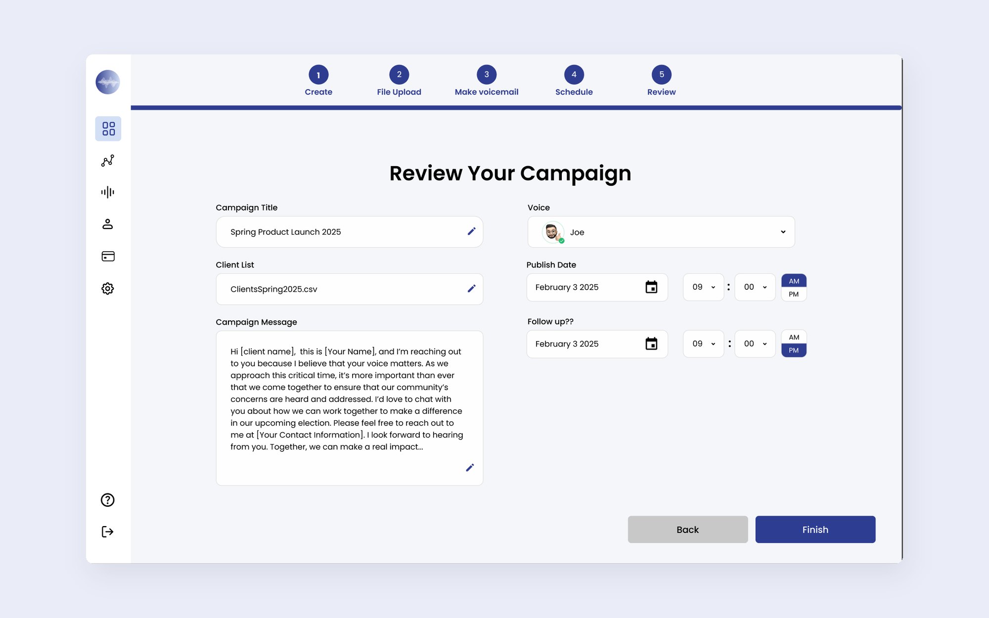
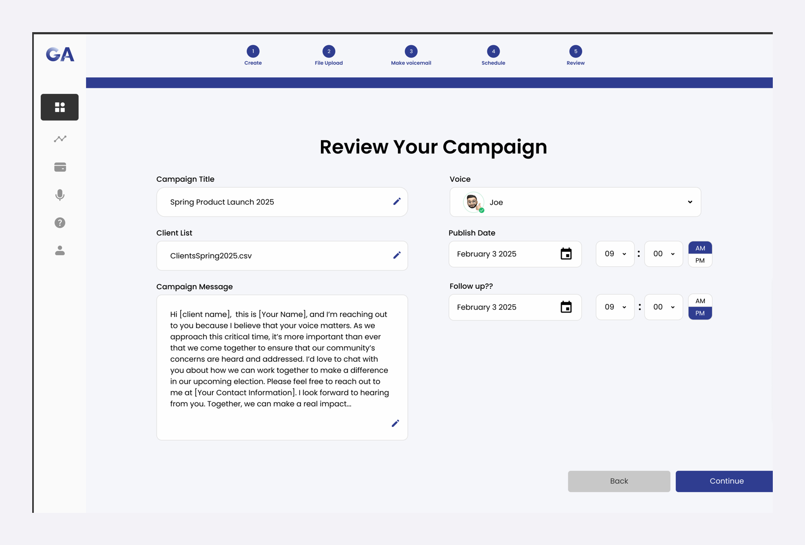
Step 5 of 5 · Review
Every field is editable in one summary before launch.
Designing for AI
Users describe the tone, purpose, and key details, and AI Prompt Assist writes a script. The output is never final: it's fully editable, personalization chips insert variables with one tap, and users preview the voicemail on a placeholder client before continuing.
A timeline shows when the first and second voicemails go out, and the follow-up gets the same AI assist and editing tools.

Testing & feedback
We worked in weekly cycles: low-fi work shared with the design team midweek, mid-fi work reviewed by leadership, then a final iteration.
10
I tested Figma prototypes of the web flows to find where people got stuck, then iterated quickly.
Heat mapping
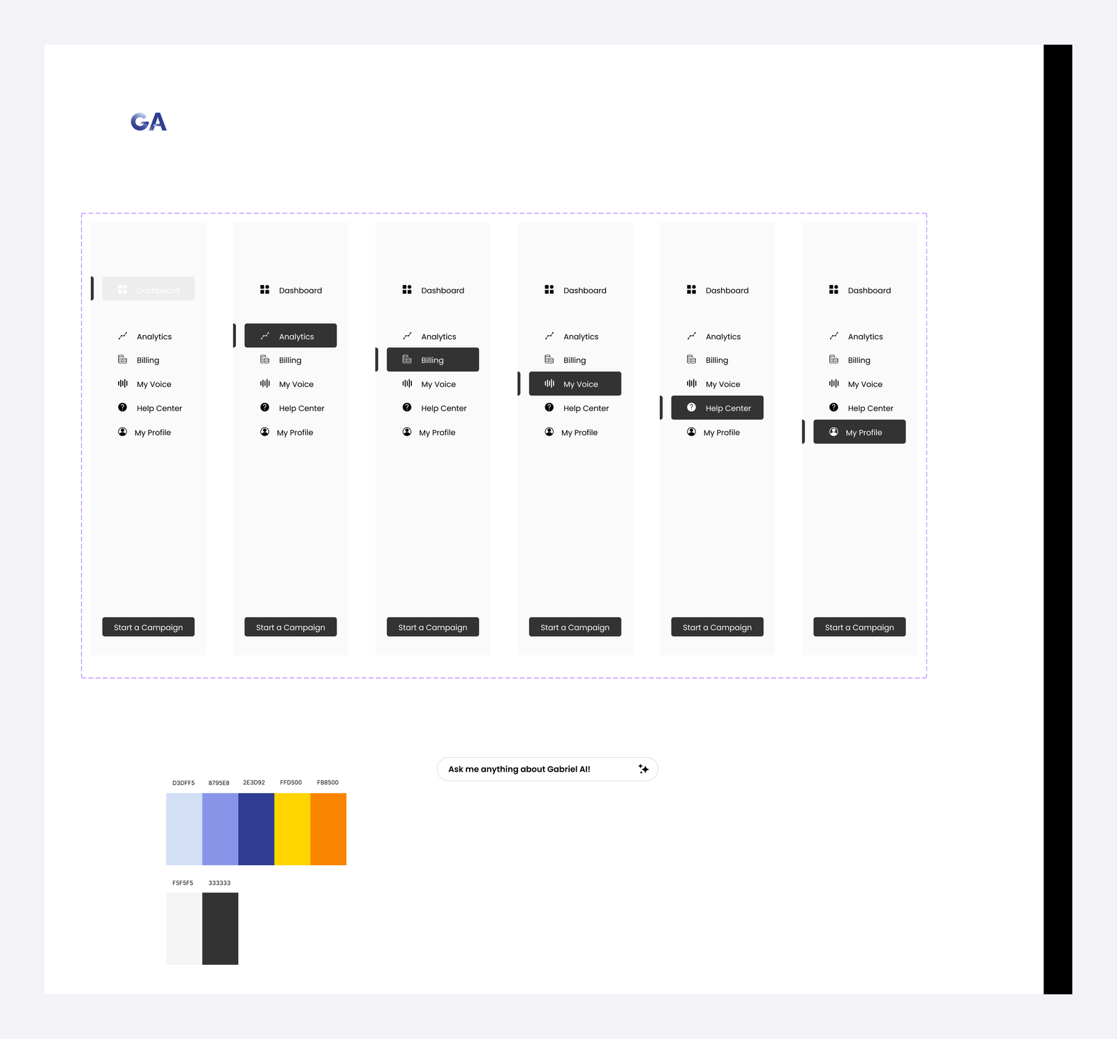
We used heat maps to place the main action, then updated the side menu on every screen to match.
Weekly reviews
Each round pushed me to explain my decisions clearly and cut what didn't help users.
Iteration
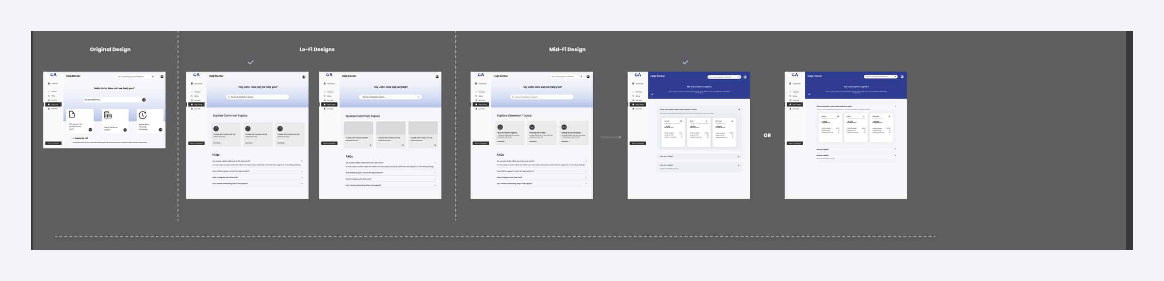
I redesigned the Help Center across lo-fi, mid-fi, and hi-fi rounds into guides for subscriptions, credits, and setting up a campaign.
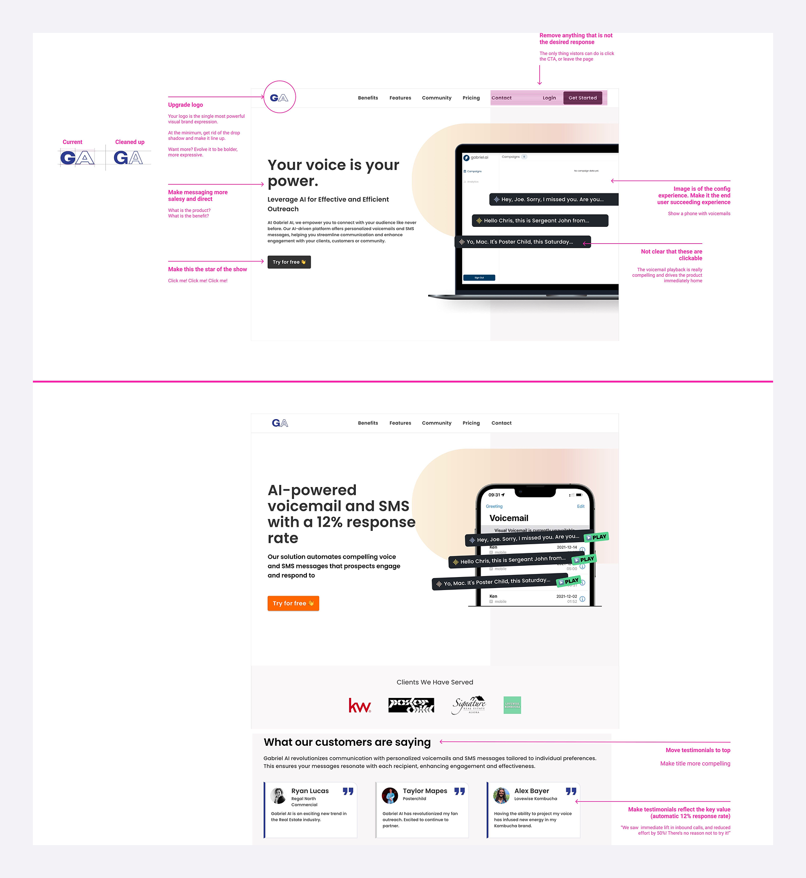
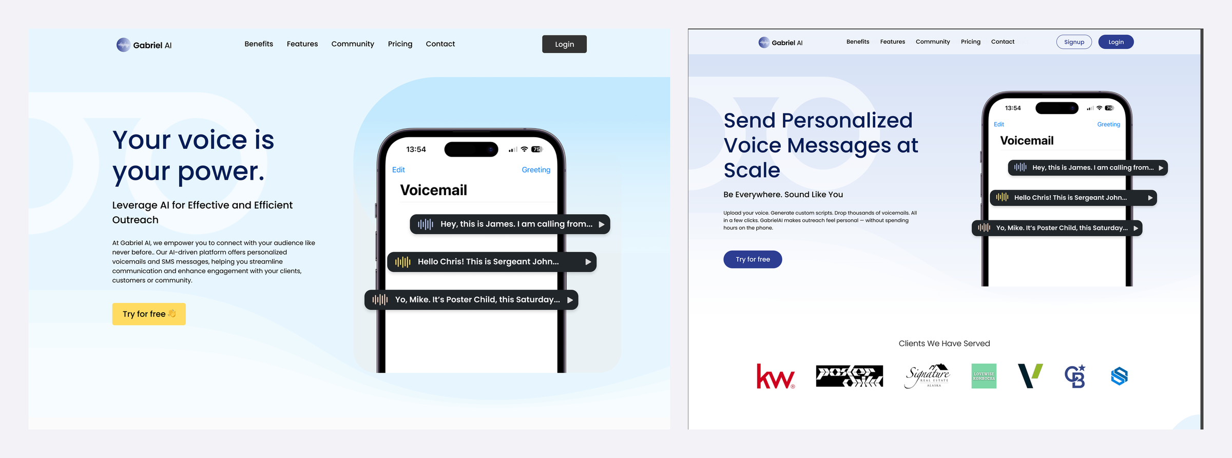
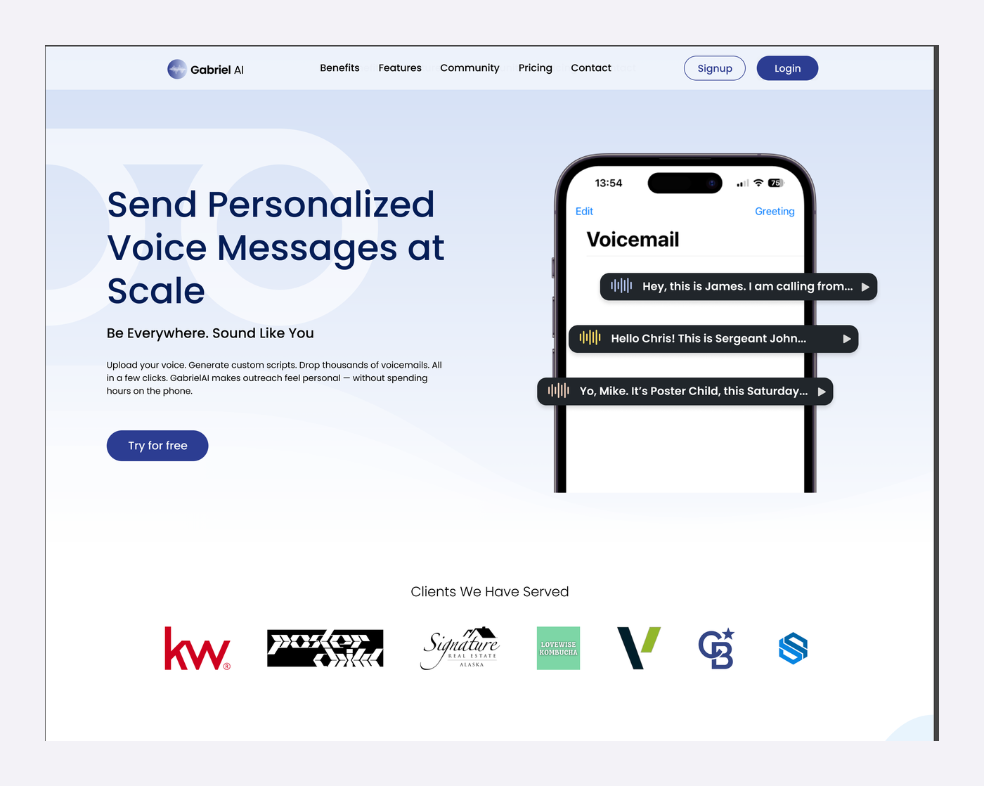
The new page explains the product in one line, shows it on a phone, adds client logos for credibility, and keeps navigation and the main call to action visible.
Final design
Everything in one place, every field editable, and nothing goes out until the user approves the AI-written message.
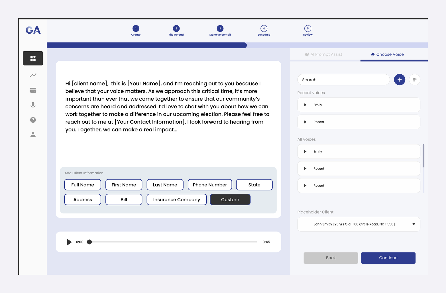
Search recent and saved voices, preview them, and test the message on a placeholder client.
"Send personalized voice messages at scale," with voicemails on a phone and client logos right below.
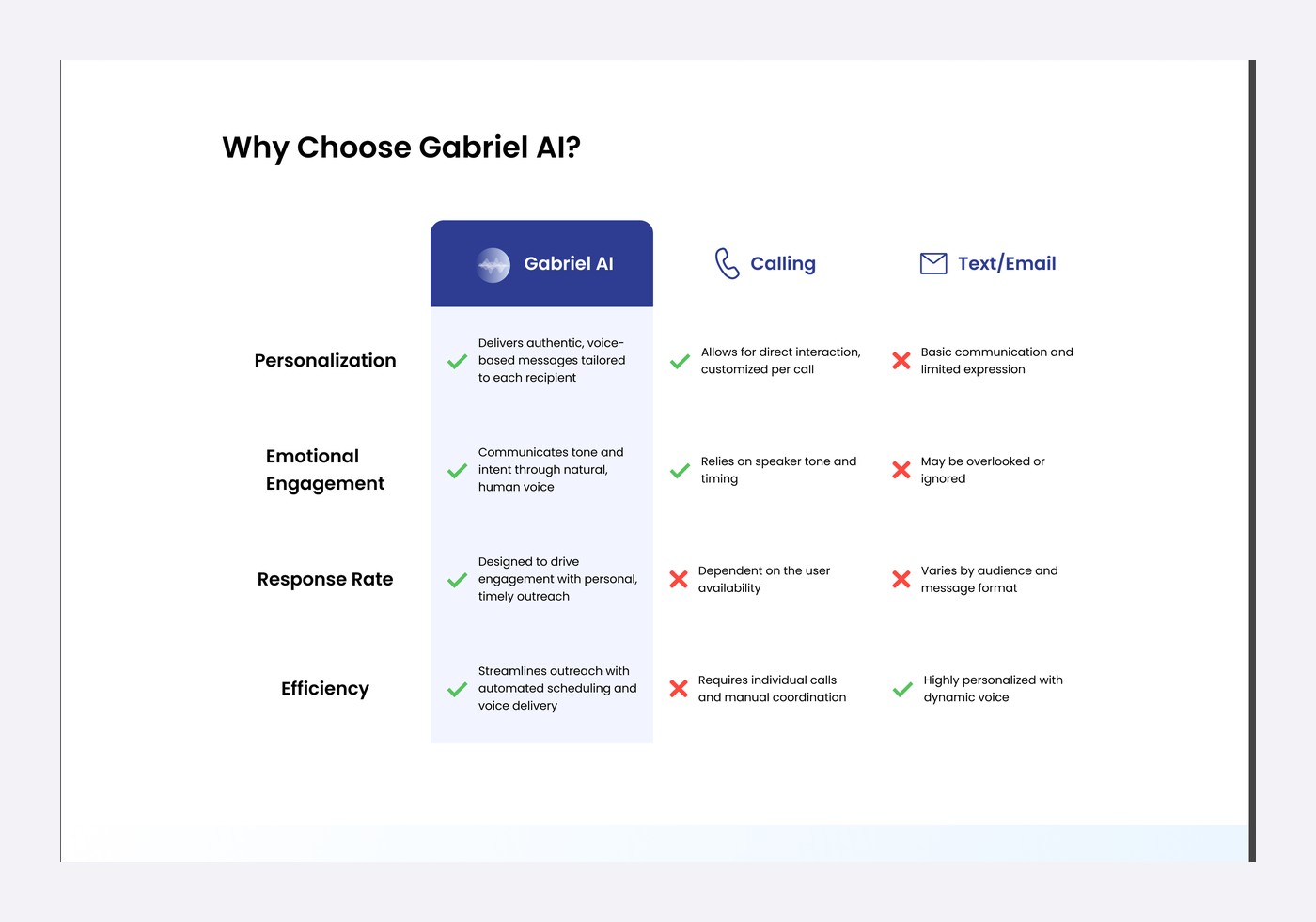
A comparison against calling and text/email on personalization, engagement, response rate, and efficiency.
A cleaned-up GA logo, a deep blue palette with yellow and orange accents, a type scale, and consistent side navigation.
Impact
Launch visitors got a site that explains the product in seconds, and new users got a guided path from uploading contacts to sending their first AI voicemail campaign.
View Gabriel AI on Product Hunt →Reflection
01
Making the AI draft editable, previewable, and approved before launch mattered more than any single visual.
02
Weekly reviews on a startup team taught me to explain my decisions simply.
03
Tracking from day one would show exactly where users drop off in the campaign flow.
